OVERVIEW
The brand at a glance
TechMeka's brand was two disconnected hex codes with no system behind them - no scale, no rule for a third color, nothing that held up once dark mode or real financial data entered the picture. I built a full color and type system from those two colors alone: every new hue comes from rotating the primary's hue by the golden angle, every tint and shade comes from scaling by the golden ratio, so nothing in the system was picked by eye. The old brand mark was dense, not scale able. The new mark is simple, scaleable, and has a place in the color system.
Tools
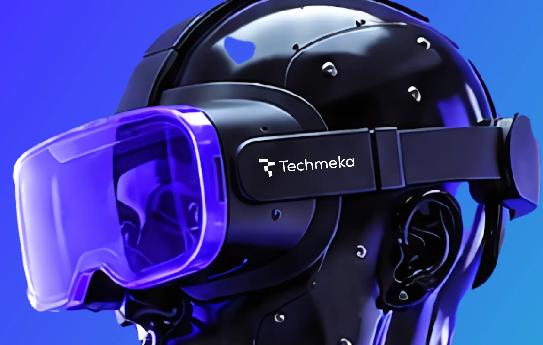
TechMeka brand system, indigo and sky palette applied across product UI & Social Media
REBRAND
Why the old identity failed
What was already in market
01
The brief was narrow on purpose: keep #4337FF and #2D9CDB exactly as they are, and build everything else accent, semantic states, neutrals, a type system, both a light and a dark theme as a system that clearly grows from them rather than sitting next to them.
02
Fintech UI has more color surface area than a marketing site: success states, danger states, financial "growth" that needs to read differently from a generic success toast, tabular numbers that have to be unambiguous at a glance. None of that existed yet.
IDENTITY
From monogram to motion
The old mark was a dense, interlocking T+M monogram - mitered corners, a compressed slab-serif wordmark, almost no negative space. It read as generic 2000s-era IT-consultancy signage: technically competent, but indistinguishable from hundreds of similar T/M monograms, and it broke down badly at favicon size where the interior negative space just filled in solid.
The new mark drops the monogram entirely for a single gesture: four rounded blocks stepping upward and to the right, reading at once as an abstracted T and as a rising staircase or bar chart - a shape with "growth" built into it rather than spelled out. It's built from one repeated corner radius and one proportion rule instead of a dozen mitered joins, so it holds up from a 16px favicon to a building sign, and unlike the old mark it now has somewhere to live in the brand's color system instead of being locked to black on white.

Previous mark
Previous TechMeka logo, an interlocking T and M monogram with a slab-serif wordmark

New mark
New TechMeka mark, four rounded blocks stepping upward as an abstracted T and growth motif
REBRAND GOALS
What the rebrand had to do
Keep the two existing brand colors exactly as they are - the system has to grow from them, not replace them.
Give every UI state success, growth, info, danger - its own color, without any of them reading as decoration.
Hit WCAG AA text contrast in both a light and a dark theme, not just on the marketing site.
Extend two brand colors into a full type and color system without it feeling bolted on.
DISCOVERY
What the old brand was missing
Discovery methods
- 01Derived every new hue by rotating the primary's hue by the golden angle (137.5°) instead of picking accent colors by eye.
- 02Built tint and shade scales where each step's distance to white or black divides by φ (1.618), instead of even linear steps.
- 03Contrast-checked every text/background pairing against WCAG AA in both themes before finalizing any token.
- 04Paired the display typeface against a quieter UI face and a monospace built specifically for account numbers and IDs.
Brand insights
- 01The brand indigo at full saturation fails text contrast on a dark background (2.98:1) - dark mode needed its own lighter tint, not the raw brand hex.
- 02"Success" and "growth" needed to be two different greens, or a confirmation toast and a rising balance chart would compete on the same screen.
- 03A separate Info color wasn't needed - the existing secondary blue already was one, which kept the core palette at five colors instead of six.
- 04Two brand colors alone don't specify a relationship between them - the golden angle gave a repeatable rule for every new hue instead of one-off choices.
STRATEGY
The rebrand decision
Two colors, one formula
Instead of choosing new brand colors by eye, every addition to the palette came from the same rule: rotate the primary's hue by the golden angle (137.5°) to find it, and scale its tints and shades by the golden ratio (1.618). That's what ties Coral, Success, Growth, and Danger back to the same #4337FF the brand started with — nothing in the system is an arbitrary pick.
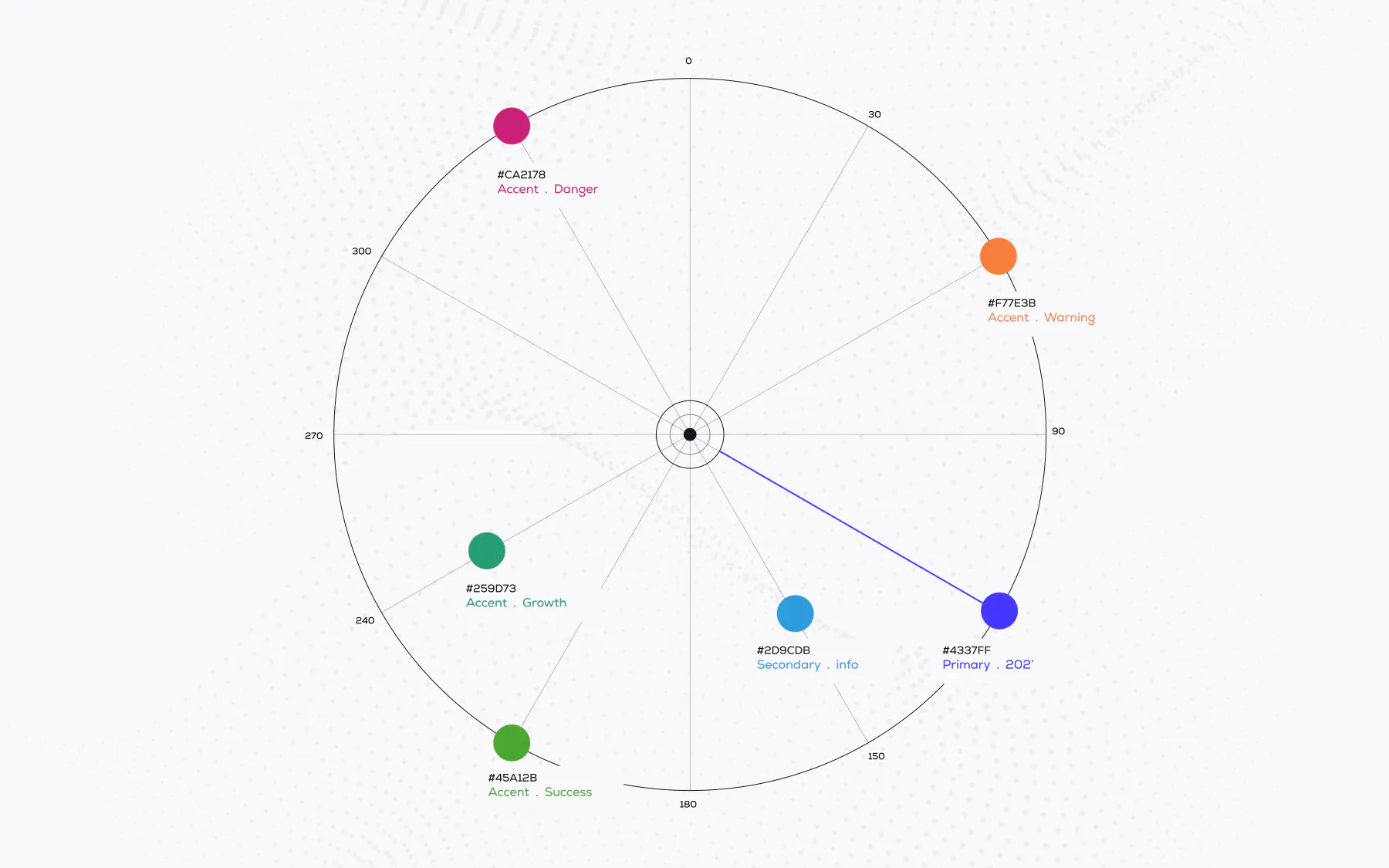
Two colors, one formula
Strategy artifacts that locked positioning before any visual exploration began.
VISUAL SYSTEM
Lockups, colour, type, rules

Primary mark
01The stepped four-block glyph, black on light surfaces.
Reversed mark
02White mark on Indigo or on a dark surface.

Gradient mark
03Indigo-to-Sky gradient across the steps, hero and marketing use only.

Product
04Text logo with product name. Used on the product UI and marketing site.
App Icon
05App icon, and anywhere below 32px.
Icon only
06Favicon, app icon, and anywhere below 32px.
Indigo
Primary brand color, unchanged. Buttons, links, brand mark.
Sky
Secondary brand color, unchanged. Also stands in as Info.
Coral
Accent, one golden-angle turn from Indigo. The only warm color one action per screen, never more.
Success Green
UI confirmation states saved, passed, verified.
Growth Emerald
Financial meaning only positive balances, upward chart lines. Deliberately not the same green as Success.
Danger Rose
Errors and destructive actions. A rose-red rather than a stock red, still unambiguous.
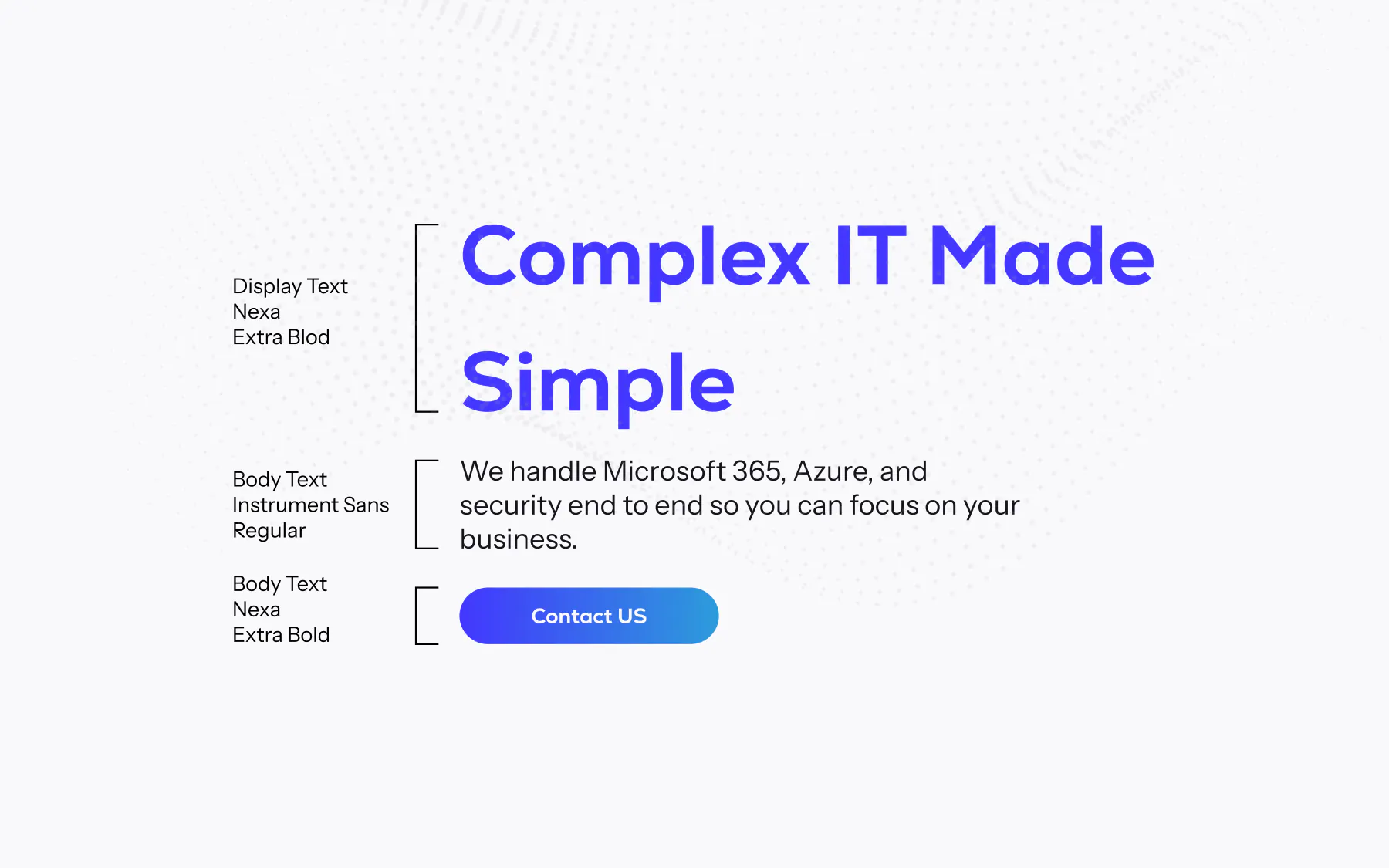
Nexa · Bold
Headlines and the logotype only.
Rebuilding trust in every transaction
Instrument Sans · 400–600
Everything a person reads for more than a few seconds forms, labels, help text.
Verify your identity to continue
JetBrains Mono · 400–500
Balances, account numbers, reference IDs anywhere 0/O or 1/l/I ambiguity matters.
PKR 248,910.44 · IBAN PK36 SCBL 0000 0011 2345 6702
color.primary.base
Indigo (#4337FF), unchanged brand primary. Buttons, links, brand mark.
color.secondary.base
Sky (#2D9CDB), unchanged brand secondary. Doubles as the Info color.
hue.rotation
137.5° golden-angle turns from Indigo generate Coral, Success, Growth, and Danger.
scale.ratio
φ = 1.618. Each tint/shade step divides its remaining distance to white or black by φ.
type.display
Nexa - headlines and the logotype only, never set in paragraphs.
type.mono
JetBrains Mono for every balance, IBAN, and reference ID.
[ IDENTITY_SPECIMENS ]
Use of logo & Colors
Type system
Nexa, Instrument Sans, and JetBrains Mono, each with a fixed role and no overlap.
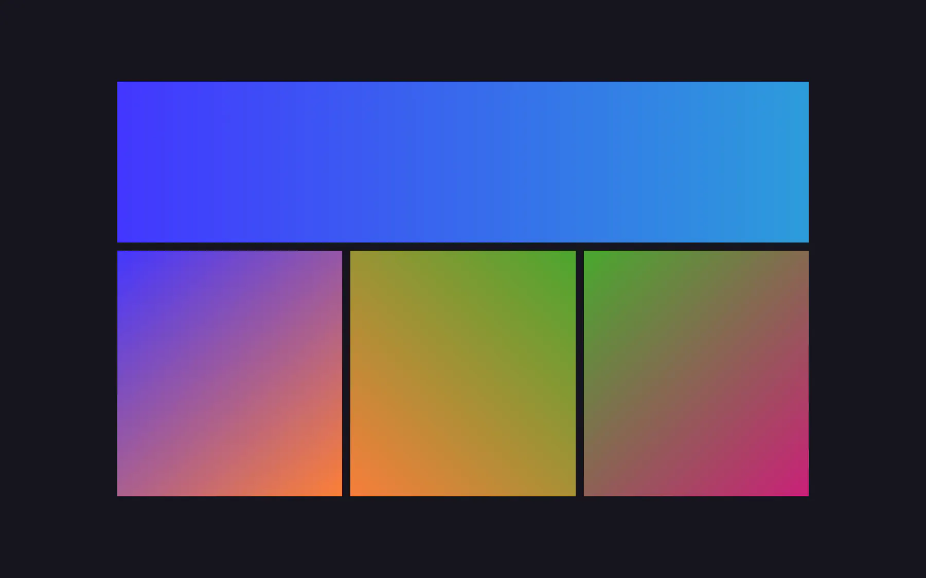
Gradients
Gradients used in the product UI and marketing site.
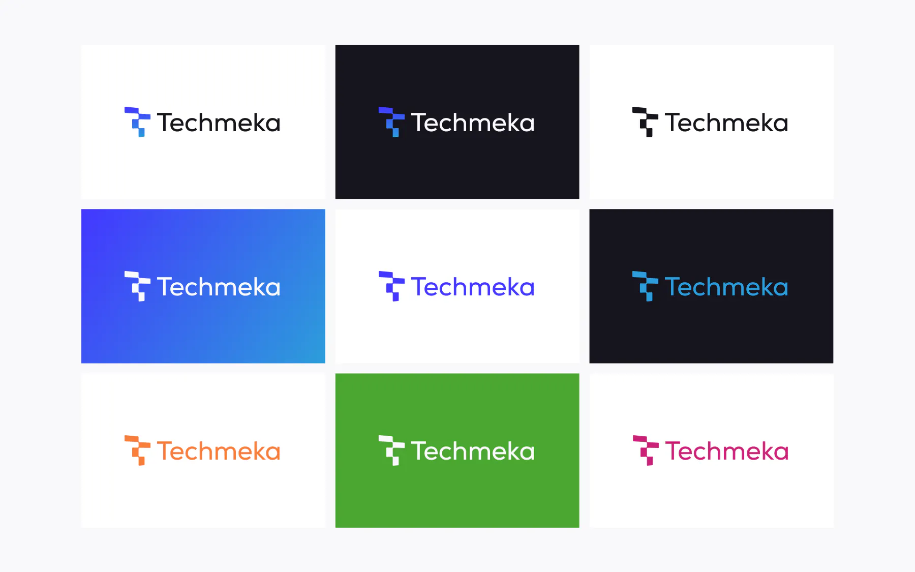
Logo in color
All logo colors and treatments.
BRAND IN USE
The rebrand in use
Application surfaces are where a system either holds or falls apart. These are the shots that prove the rules survive contact with production.
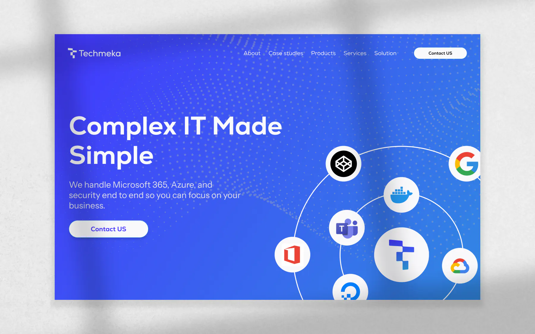
Website hero
Website hero section with the new brand mark and gradient.
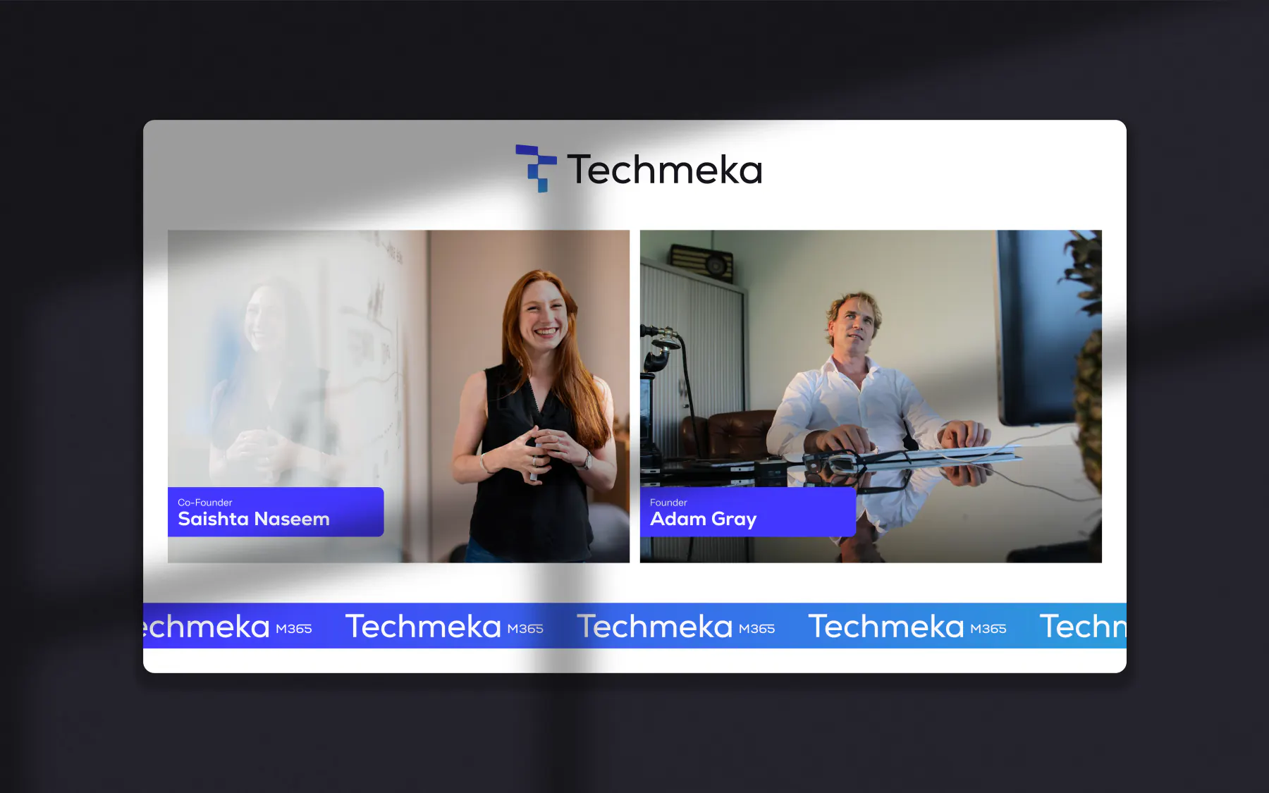
Google meet , Zoom
Call Screen with Techmeka brand for Google meet and Zoom
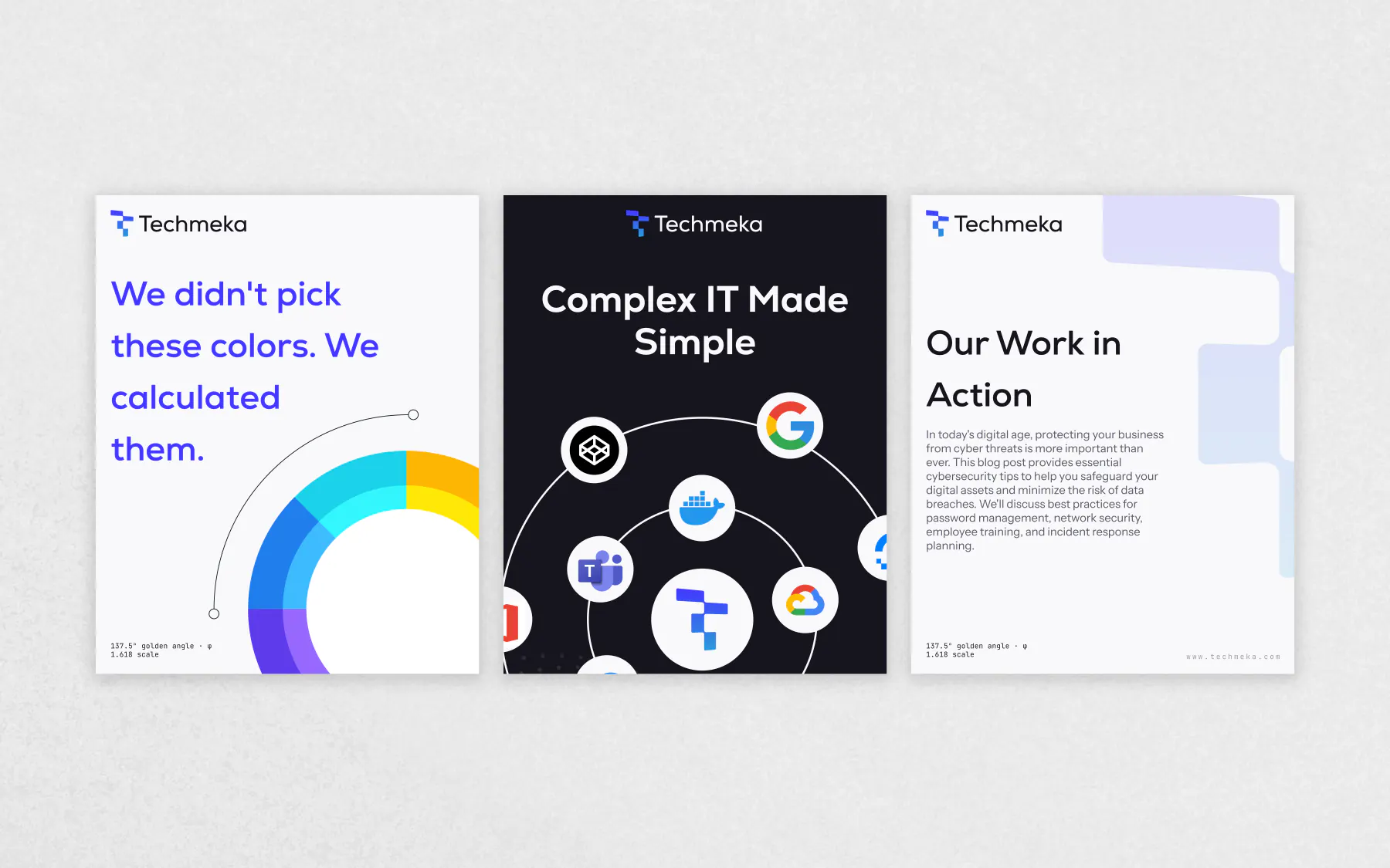
Marketing site
Social Post with Techmeka brand for LinkedIn, instagram and Twitter
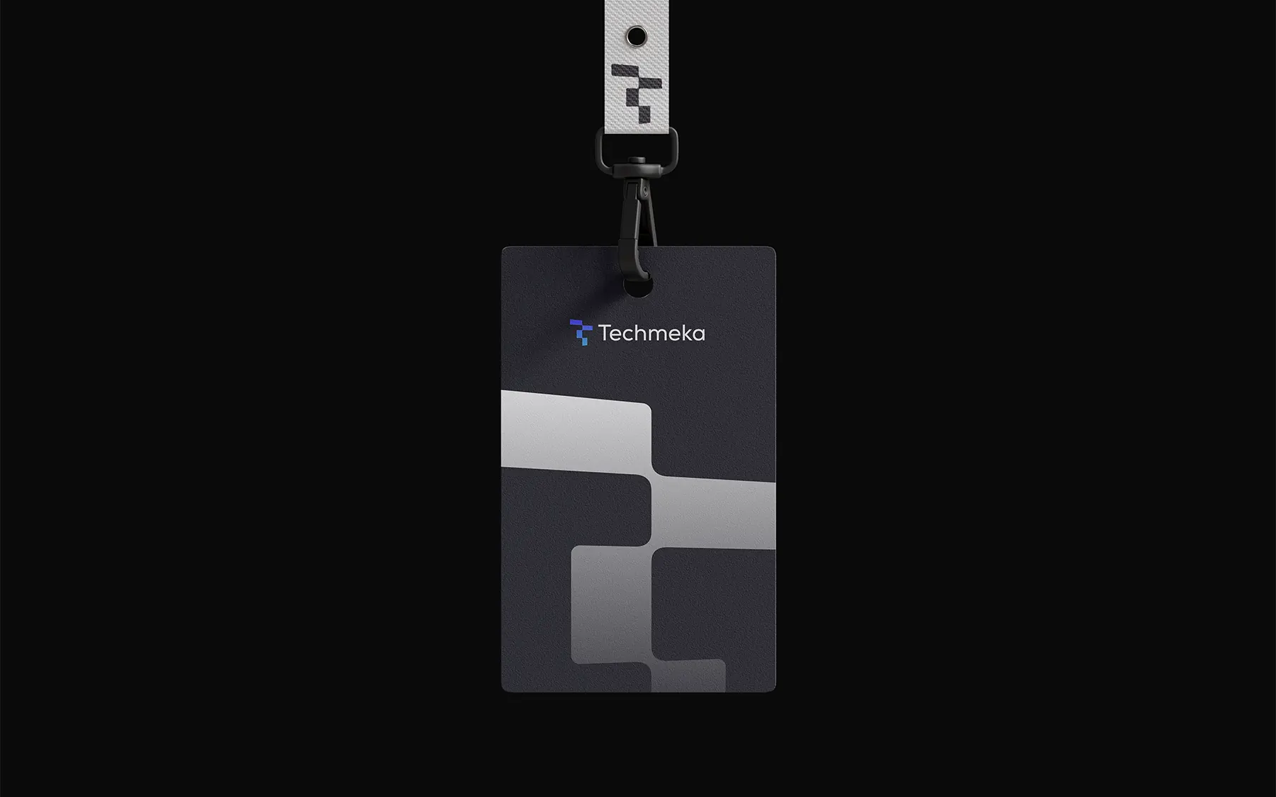
Office Card
Techmeka Office Card with QR code and contact information
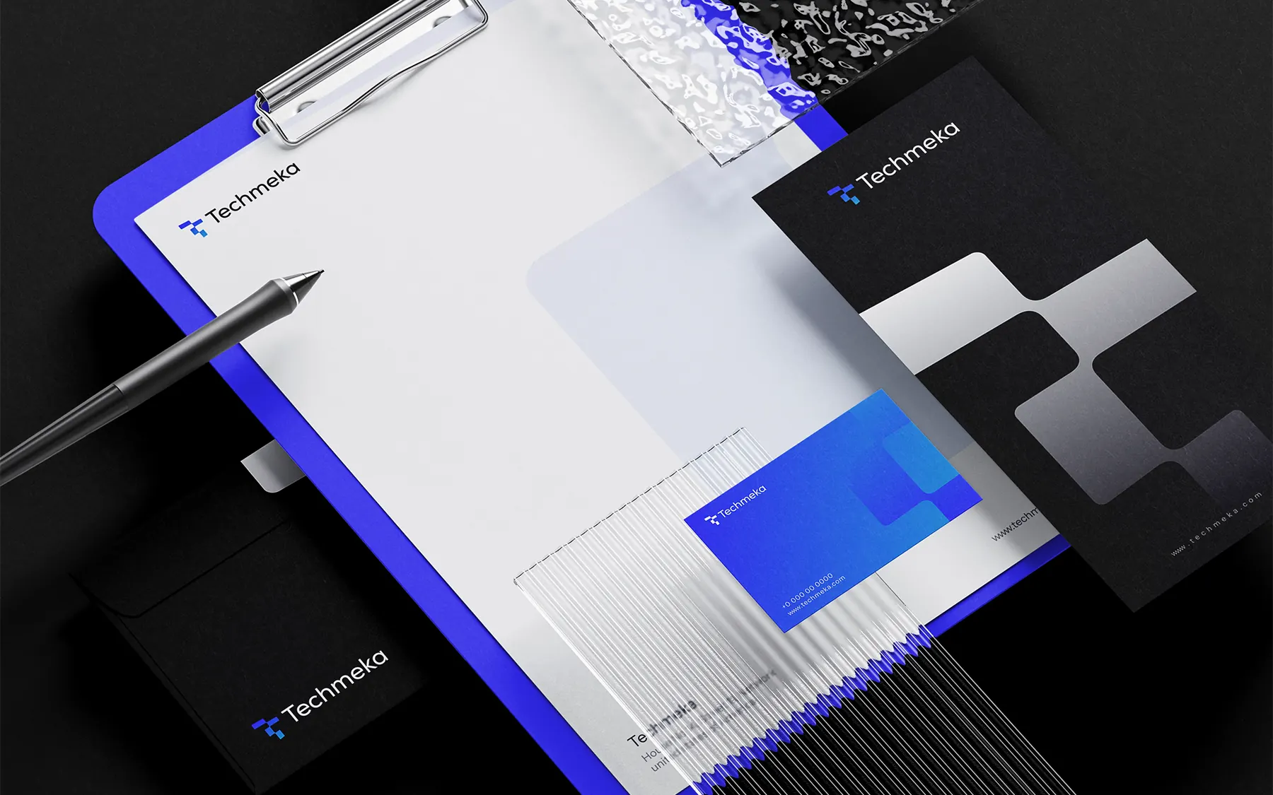
Statuinary
Statuinary with Techmeka brand for office, business card and other printed materials

Marketing site
Billboard with techmeka brand in the city of Karachi
RESULTS
Outcomes and evidence status
Brand rollout framework
Market context
The brief was narrow on purpose: keep #4337FF and #2D9CDB exactly as they are, and build everything else accent, semantic states, neutrals, a type system, both a light and a dark theme as a system that clearly grows from them rather than sitting next to them.
Perception gap
The old mark was a dense, interlocking T+M monogram - mitered corners, a compressed slab-serif wordmark, almost no negative space. It read as generic 2000s-era IT-consultancy signage: technically competent, but indistinguishable from hundreds of similar T/M monograms, and it broke down badly at favicon size where the interior negative space just filled in solid. Two brand hex codes extended into a golden-ratio color and type system - built for fintech UI, not picked by eye.
Positioning decision
Two colors, one formula
System rollout
Derived every new hue by rotating the primary's hue by the golden angle (137.5°) instead of picking accent colors by eye.
In-market read
The brand indigo at full saturation fails text contrast on a dark background (2.98:1) - dark mode needed its own lighter tint, not the raw brand hex.
Metrics hidden for now
Quantitative result cards are temporarily hidden until each metric has fully documented definitions, source snapshots, and reporting context.
NEXT
What I'd do next
01
Apply the palette and type system to the marketing site and product dashboard.
02
Extend the stepped mark into its color treatments for real-world placements.
03
Document component-level tokens buttons, forms, charts on top of the base palette.