OVERVIEW
The brand at a glance
TaxDoctor simplifies taxation for individuals, entrepreneurs, and businesses across Pakistan and China, but the category around it runs on fear, jargon, and grey compliance-firm visuals. I rebuilt the identity around a single idea: taxation should feel like a diagnosis, not a burden. The system ships as a logo family, a written brand narrative and tone of voice, and a color and type system the team can apply without a designer in the room.
Tools
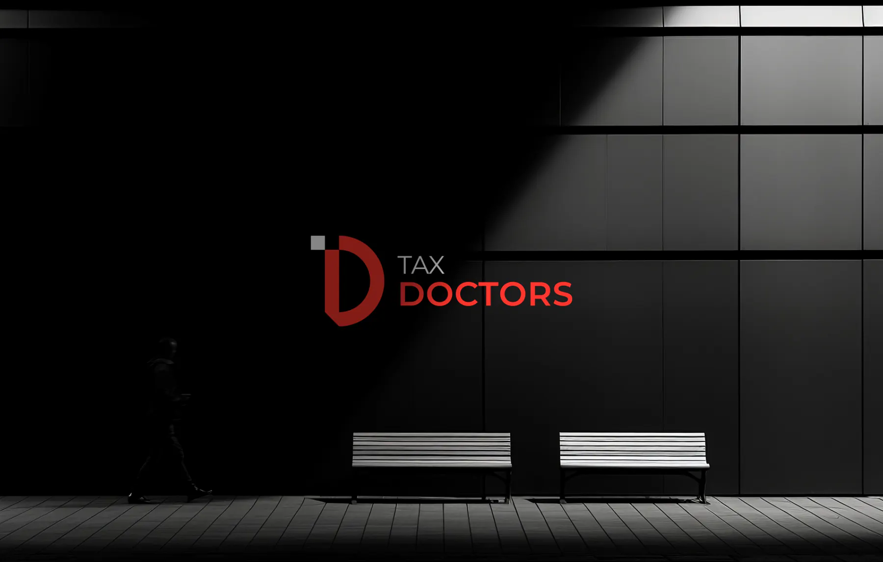
Brand identity for TaxDoctor - mark applied across a studio environment
NEW IDENTITY
Why a new identity was needed
What the brief required
01
Taxation is rarely approached with confidence. For entrepreneurs, SMEs, and multinational clients, it is one of the most complex and anxiety-inducing parts of running a business, made harder by operating across two very different regulatory systems, Pakistan's changing tax laws and China's strict compliance regulations.
02
The brand needed to hold two things at once: technical credibility in front of accountants and corporations, and approachability for individuals encountering tax help for the first time. Most competitors default to either cold, corporate minimalism or generic finance-app friendliness, neither of which builds the kind of trust a cross-border consultancy needs.
IDENTITY GOALS
What the new identity had to do
Read as trustworthy and precise to both individual and corporate clients.
Translate a bilingual, cross-border service into one coherent visual language.
Reserve a single confident accent color that signals action and authority.
Ship a narrative and tone of voice the team can write from without a designer in the room.
DISCOVERY
Research before the first mark
Discovery methods
- 01Category audit of tax and financial consultancy branding across Pakistan and China.
- 02Positioning workshop built around the "doctor" metaphor: listen, diagnose, prescribe.
- 03Narrative development across Who We Are, What We Do, Why Choose Us, and Manifesto.
- 04Mark construction and legibility testing from favicon scale to signage.
Brand insights
- 01Clients don't want more compliance jargon, they want a partner who translates it.
- 02The "doctor" framing outperformed generic "expert" or "advisor" language in tone testing.
- 03A single confident red, used sparingly, read as more credible than a busy multi-color system.
- 04The D-mark needed to work standalone, since it would appear far more often than the full wordmark.
STRATEGY
The identity decision
Position on clarity, not complexity
Every firm in this category claims expertise, so the claim carries no information. TaxDoctor instead owns clarity: the partner who makes complicated tax systems clear and actionable. That single decision shaped the whole visual language, a bold geometric D mark built from a clean cut circle, a confident Crimson Red used as a precision accent rather than decoration, and a tone of voice that guides instead of overwhelming. The brand narrative follows the same logic, structured like a diagnosis: understand the client, explain the system, prescribe the solution.
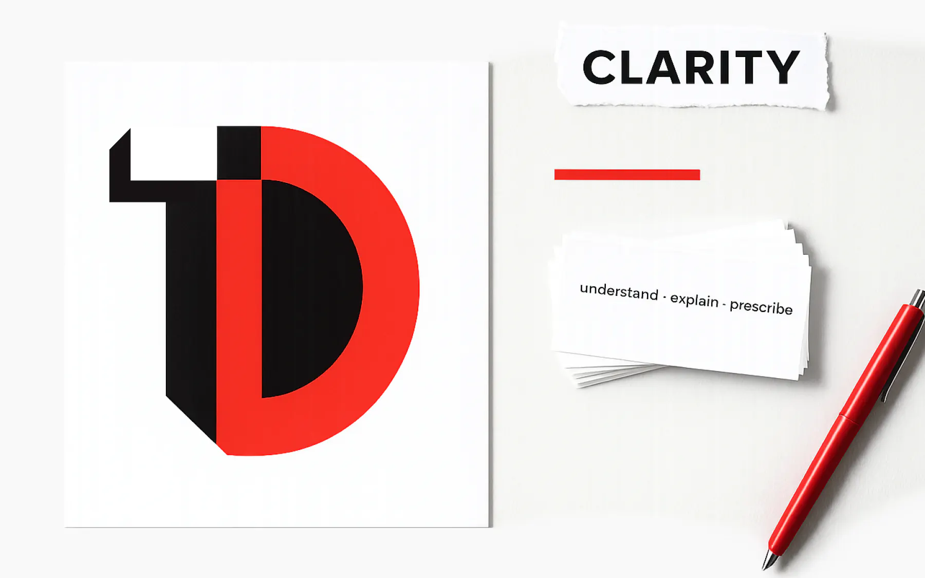
Position on clarity, not complexity
Strategy artifacts that locked positioning before any visual exploration began.
VISUAL SYSTEM
Lockups, colour, type, rules

Primary lockup (horizontal)
01Default. Web header, deck covers, and signage.

Stacked lockup
02Square crops. Social avatars, app tiles, and vertical formats.

Icon only
03Below 24px. Favicon, app icon, and small-format applications.
Crimson Red
Primary color. The mark, key accents, and calls to action.
Rich Black
Primary type and dark surfaces.
Snow White
Primary background and light surfaces.
Emerald Green
Secondary accent (golden-angle extension), success and growth cues.
Royal Violet
Tertiary accent (golden-angle extension), used sparingly for premium highlights.
Montserrat · 700
Headlines and section titles. Tracking tightens as size increases.
Who We Are
Merriweather · 400
Paragraphs at 16-20px, generous line height for long-form brand narrative.
We are built on trust, accuracy, and accessibility.
Geometric Sans · 500
Section labels and eyebrow text, uppercase, wide tracking, always in Crimson Red.
ABOUT TAXDOCTOR
color.primary
Crimson Red (#DB3932) - reserved for the mark, calls to action, and key accents.
type.display
Geometric sans, bold weight, tight tracking for headline and hero use.
type.body
Rounded grotesk for body copy, tuned for readability in long-form narrative.
grid.base
8px base unit with a 12-column desktop frame.
radius.default
Soft geometric curves echoing the D mark, no hard corners on primary shapes.
motion.enter
Clip-reveal of the D mark over 500ms, no bounce, mirroring a clean diagnosis.
[ IDENTITY_SPECIMENS ]
Use of logo & Colors
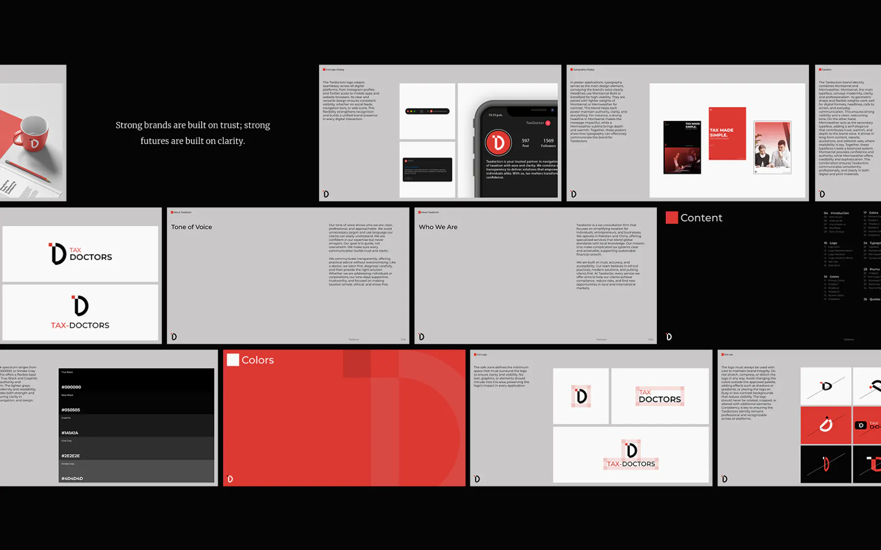
Brand book highlights
Showcasing the brand strategy and visual system
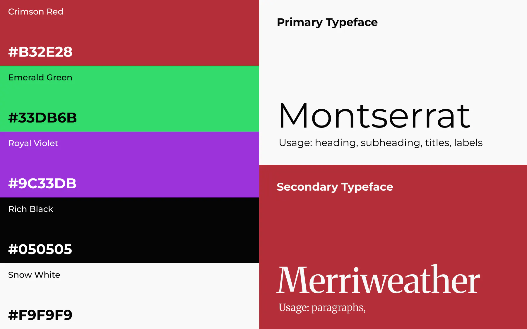
Colors & typography
Crimson Red, Rich Black, and Snow White as the core system, extended with two golden-angle accent colors.
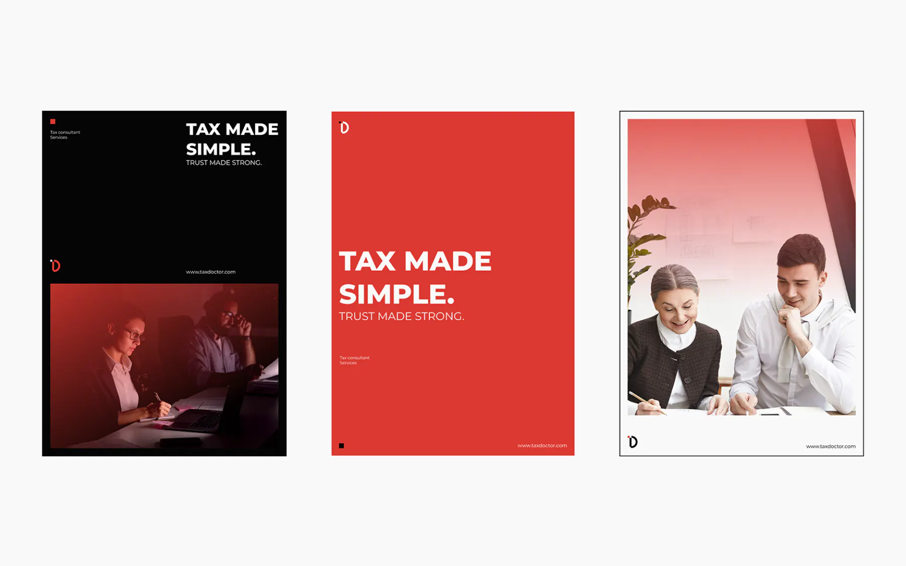
Use of typography in the brand
How the typography is used in the brand posters
BRAND IN USE
The identity in use
Application surfaces are where a system either holds or falls apart. These are the shots that prove the rules survive contact with production.

Office signage
Office signage using the icon-only lockup at architectural scale.
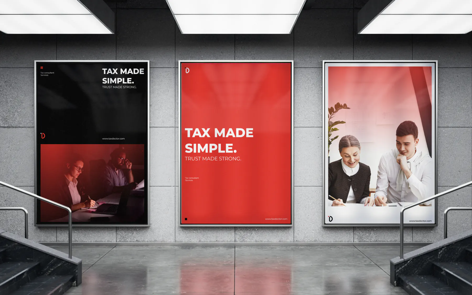
Indore Poster
Indore Poster using the typography images and the color system
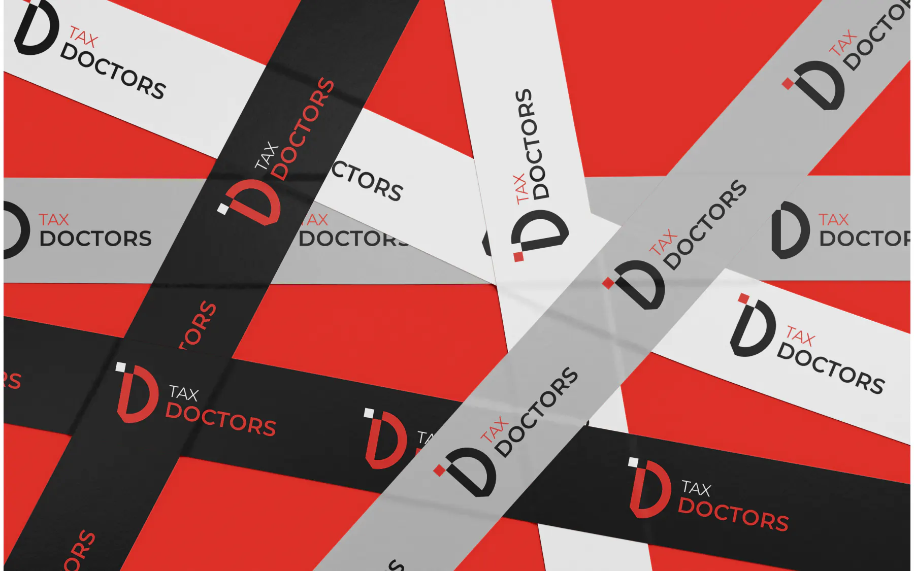
Tape Duck
Stickey tape duct using the colors and logos
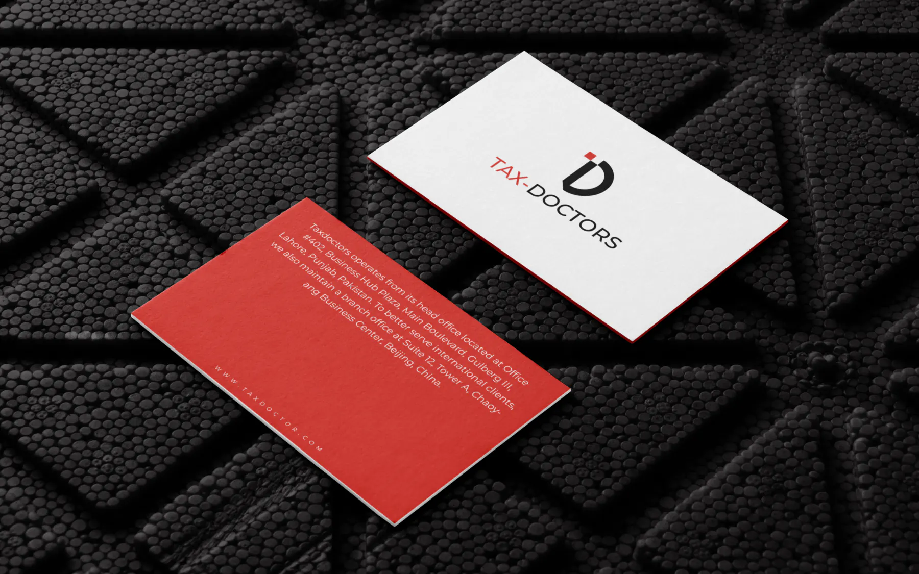
Business Card
Business Card using the colors and logos
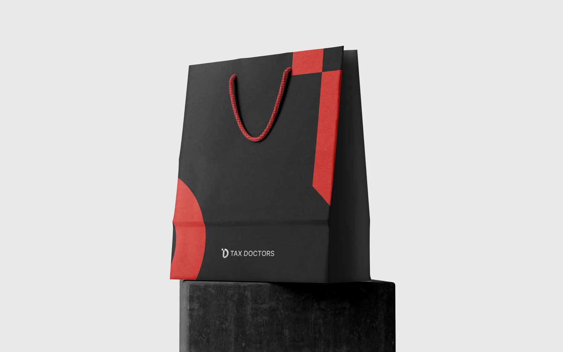
Hand Bag
Hand carrying bag using the colors and logos
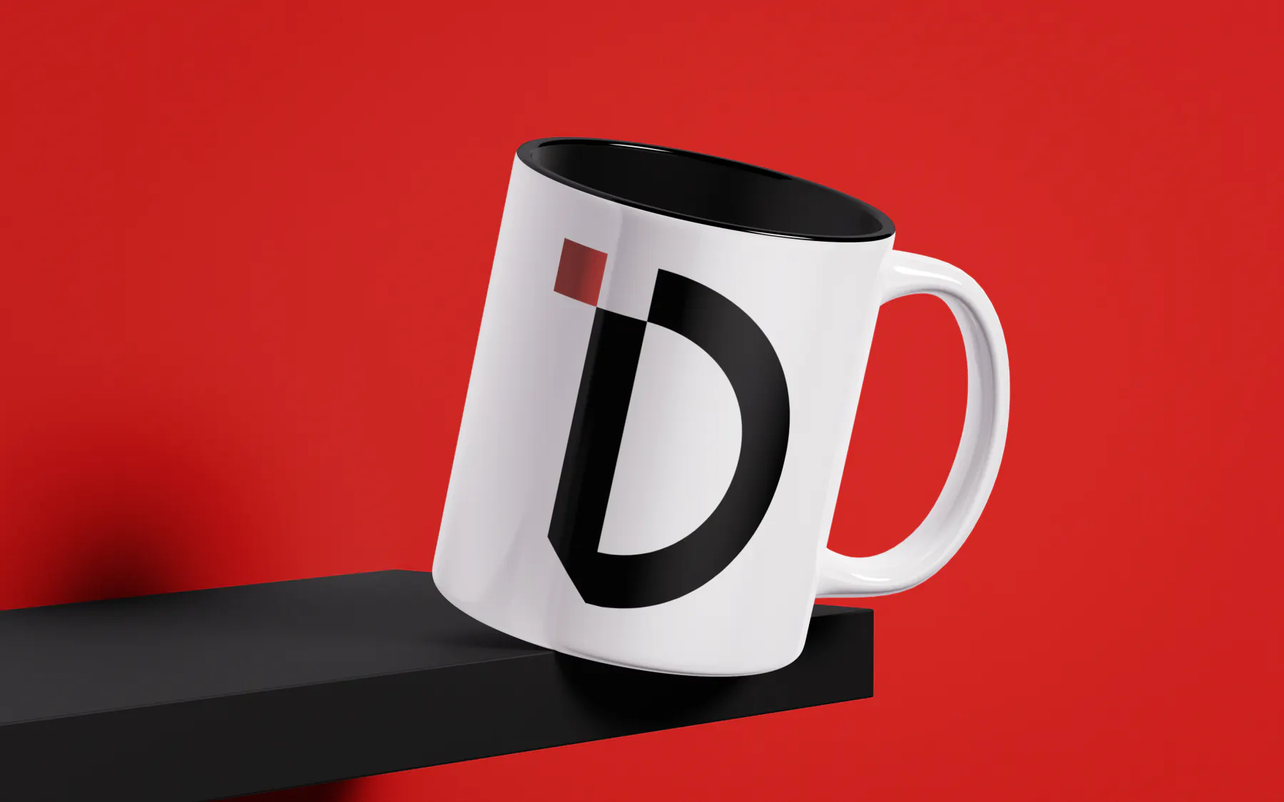
Coffee Cup
Coffee cup having large brand logo icon on it
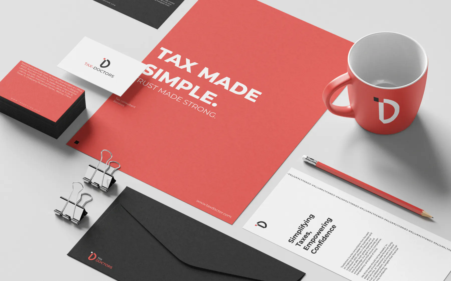
Stationery
Stationery design using colors system, typography and logos
MOTION
How the system moves
D mark draws in a single clean stroke over 500ms, then holds, no loop, no bounce.
Section reveals use a soft clip wipe, mirroring the D mark's curved geometry.
Crimson Red underline draws left to right at 300ms on hover for every primary action.
RESULTS
Outcomes and evidence status
Brand rollout framework
Market context
Taxation is rarely approached with confidence. For entrepreneurs, SMEs, and multinational clients, it is one of the most complex and anxiety-inducing parts of running a business, made harder by operating across two very different regulatory systems, Pakistan's changing tax laws and China's strict compliance regulations.
Perception gap
A complete brand identity for TaxDoctor, a tax consultation firm serving clients across Pakistan and China. The project defined the brand's narrative, tone of voice, and visual identity, turning a traditionally intimidating service into one built on clarity, trust, and approachability. Anchored by a bold Crimson Red and grounded in clean neutrals, the identity reflects TaxDoctor's promise: simplifying taxation and turning compliance into confidence.
Positioning decision
Position on clarity, not complexity
System rollout
Category audit of tax and financial consultancy branding across Pakistan and China.
In-market read
Clients don't want more compliance jargon, they want a partner who translates it.
Metrics hidden for now
Quantitative result cards are temporarily hidden until each metric has fully documented definitions, source snapshots, and reporting context.
NEXT
What I'd do next
01
Extend the system into a documented motion package for onboarding and social.
02
Build out a full stationery and pitch deck template suite.
03
Develop bilingual (English/Mandarin) type and layout guidelines.