OVERVIEW
The brand at a glance
CodeStreaks builds automation systems for engineering teams but presented itself with clip-art robots and a template wordmark. I rebuilt the identity around a single idea: automation is infrastructure. The system ships as a Figma library, a written guideline, and a launch kit the team runs without me.
Tools
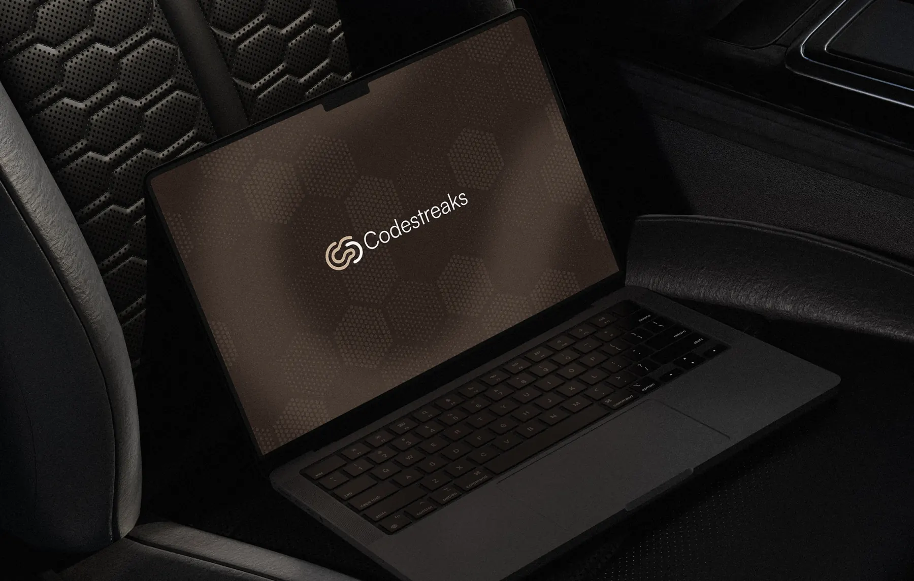
Brand identity for CodeStreaks - mark applied across a dark studio environment
NEW IDENTITY
Why a new identity was needed
What the brief required
01
The category is loud. Every competitor in AI automation was using the same gradient-and-orb visual language, which made a technically serious product read as a weekend experiment. Buyers were engineering leads with procurement budgets, and they were filtering on credibility signals before they ever booked a call.
02
The old identity failed at three specific points: the wordmark collapsed below 24px in product UI, the palette had no reserved accent so nothing could carry a call to action, and there were no usage rules, so every deck drifted further from the last one.
IDENTITY GOALS
What the new identity had to do
Read as infrastructure to a technical buyer inside three seconds.
Survive small sizes, favicon, product nav, and CLI documentation.
Reserve one accent so calls to action always have somewhere to live.
Ship usage rules the team can defend without a designer in the room.
DISCOVERY
Research before the first mark
Discovery methods
- 01Category audit across 24 competitors in AI tooling and developer infrastructure.
- 02Nine interviews with engineering leads about first-impression trust signals.
- 03Positioning workshop to lock a single sentence before any visual exploration.
- 04Contrast and legibility testing of the mark from 16px to billboard scale.
Brand insights
- 01Technical buyers read restraint as competence, density beat friendliness in every interview.
- 02The mark was seen at 20px far more often than at hero scale, so small-size behavior drove the design.
- 03A monospace layer signalled engineering credibility faster than any illustration.
- 04Teams broke the old brand because nothing told them what was allowed.
STRATEGY
The identity decision
Position on infrastructure, not intelligence
Everyone in the category claims intelligence, so the claim carries no information. CodeStreaks instead owns reliability: the system your pipeline depends on. That single decision drove the whole visual language, a structural grid, a mono voice, one high-voltage accent used sparingly, and zero decorative AI imagery. The naming architecture follows the same logic, with product tiers named after operational states rather than personality traits.
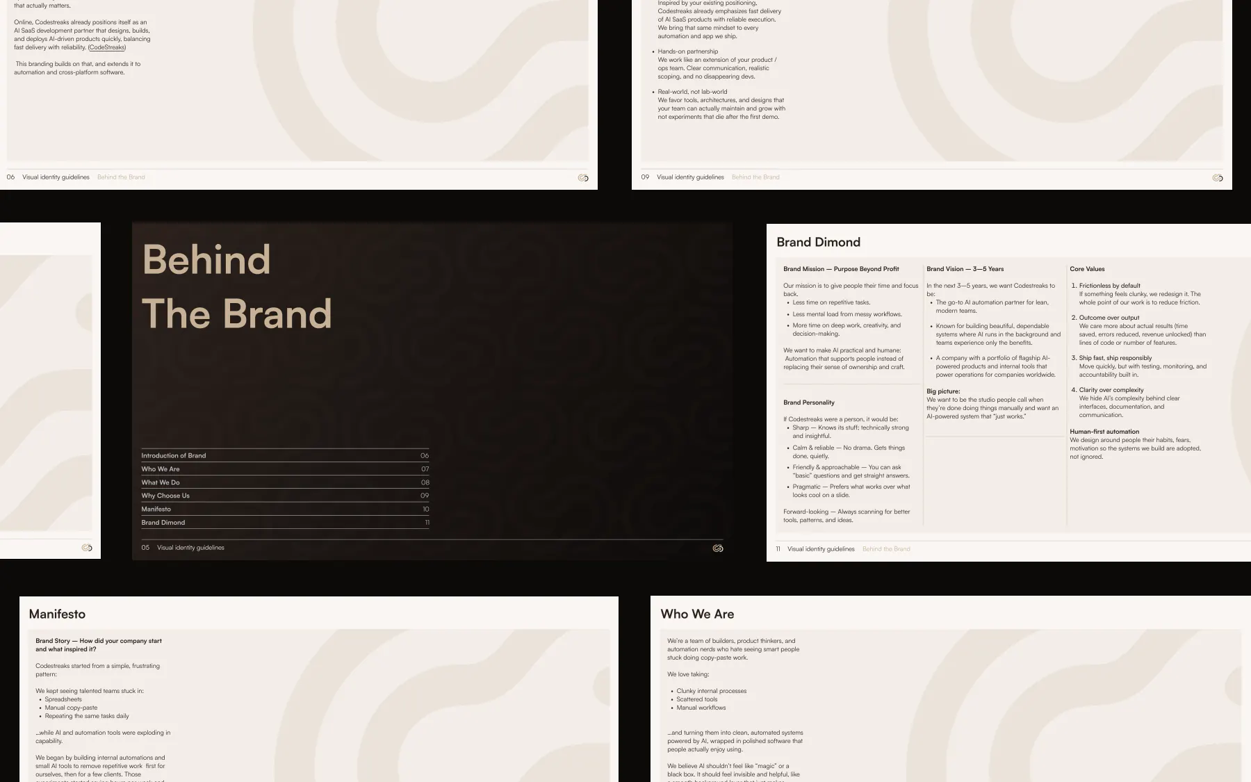
Position on infrastructure, not intelligence
Strategy artifacts that locked positioning before any visual exploration began.
VISUAL SYSTEM
Lockups, colour, type, rules

Primary lockup
01Default. Web header, deck covers, and signage.
Horizontal
02Constrained heights, email signatures and product nav.

Stacked
03Square crops. Social avatars and app tiles.

Icon only
04Below 24px. Favicon, CLI output, and notifications.

Reversed
05Light surfaces only, print collateral and invoices.
Warm Sand
Primary Color. Carries the entire system by default.
Deep Espresso
The only accent. Calls to action, live states, active nav.
Soft Ivory
Primary type on dark. Used for surfaces and backgrounds.
Nearest Black
Hairline rules, card borders, and section separation.
Golden Glow
Secondary metadata and Accent color used sparingly.
Khaki
Provides gentle contrast for hover states, pressed buttons, active navigation, and secondary surfaces.
Satoshi · 800
Headlines from 40px up. Tracking tightens as size increases.
Automation is infrastructure
Inter · 400
Paragraphs at 16-20px, 1.7 line height, 68 character measure.
The system your pipeline depends on, documented so the team can defend it.
IBM Plex Mono · 500
All labels, metadata, and status readouts. Uppercase, 0.28em tracking.
DEPLOY_STATUS · OPERATIONAL
color.primary
Voltage indigo (#C7B198) - reserved for calls to action and live states only.
type.display
Inter Tight, weight 800, tracking −4% for headline and hero use.
type.mono
JetBrains Mono for labels, metadata, and all system readouts.
grid.base
8px base unit with a 12-column desktop frame and 1px hairline rules.
radius.default
Zero radius everywhere, corners stay square across every surface.
motion.enter
600ms clip reveal on cubic-bezier(0.16, 1, 0.3, 1), no bounce.
[ IDENTITY_SPECIMENS ]
Use of logo & Colors
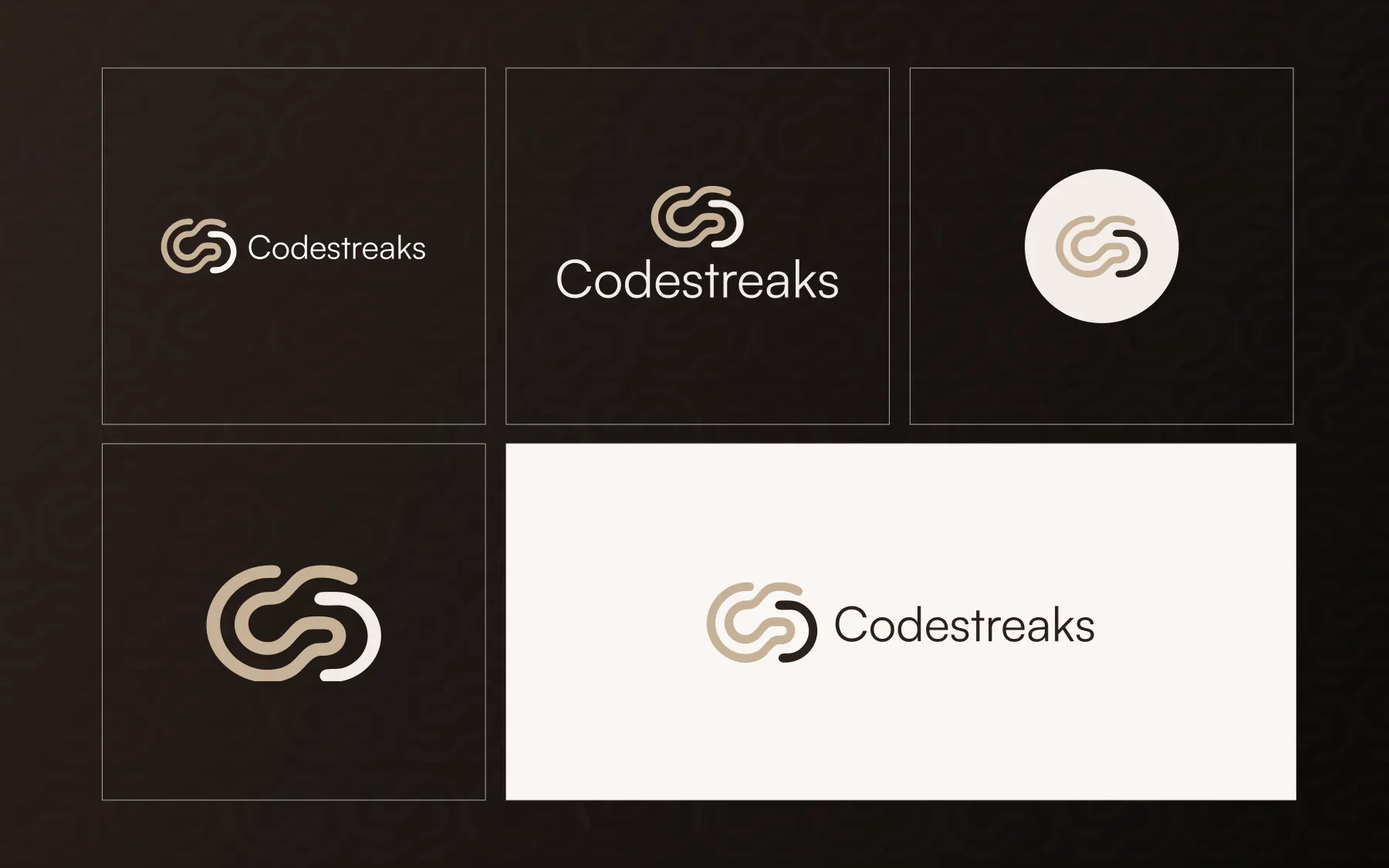
Logo lockup family
Five approved variants with clear-space rules and minimum sizes documented for each.
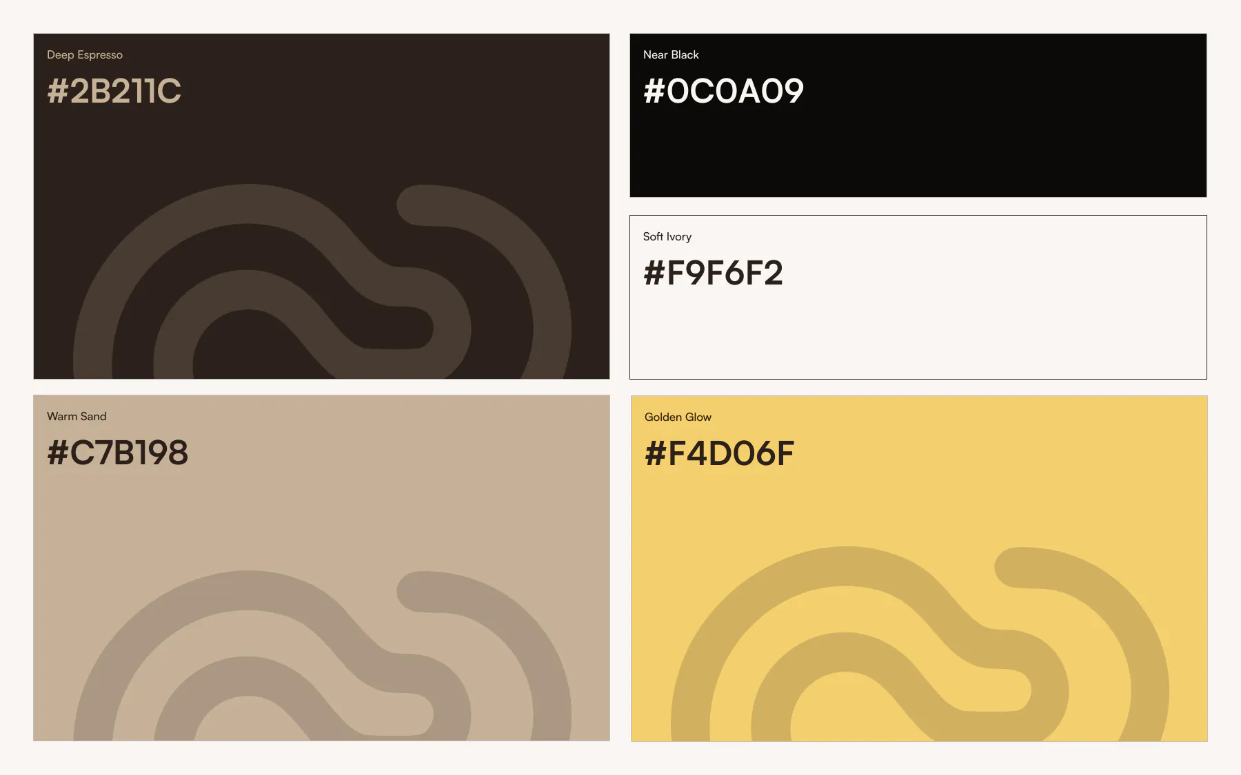
Color system specimen
Palette applied at real ratios, showing how sparingly the accent is allowed to appear.
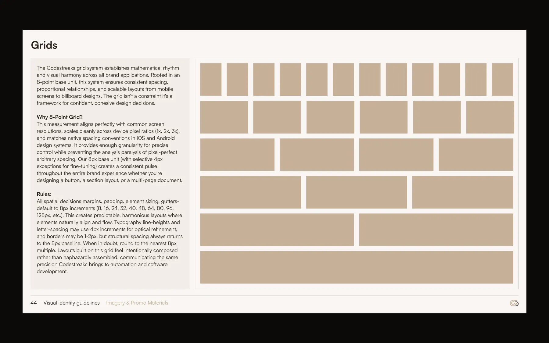
Grid and pattern system
The hairline grid doubles as a graphic device across covers, slides, and social frames.
BRAND IN USE
The identity in use
Application surfaces are where a system either holds or falls apart. These are the shots that prove the rules survive contact with production.
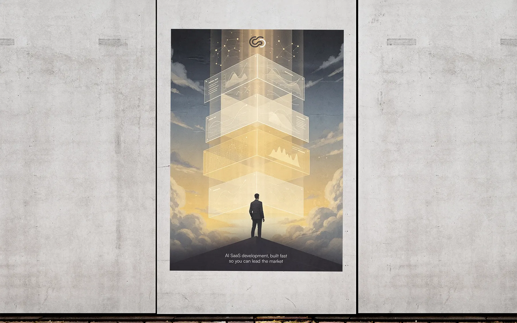
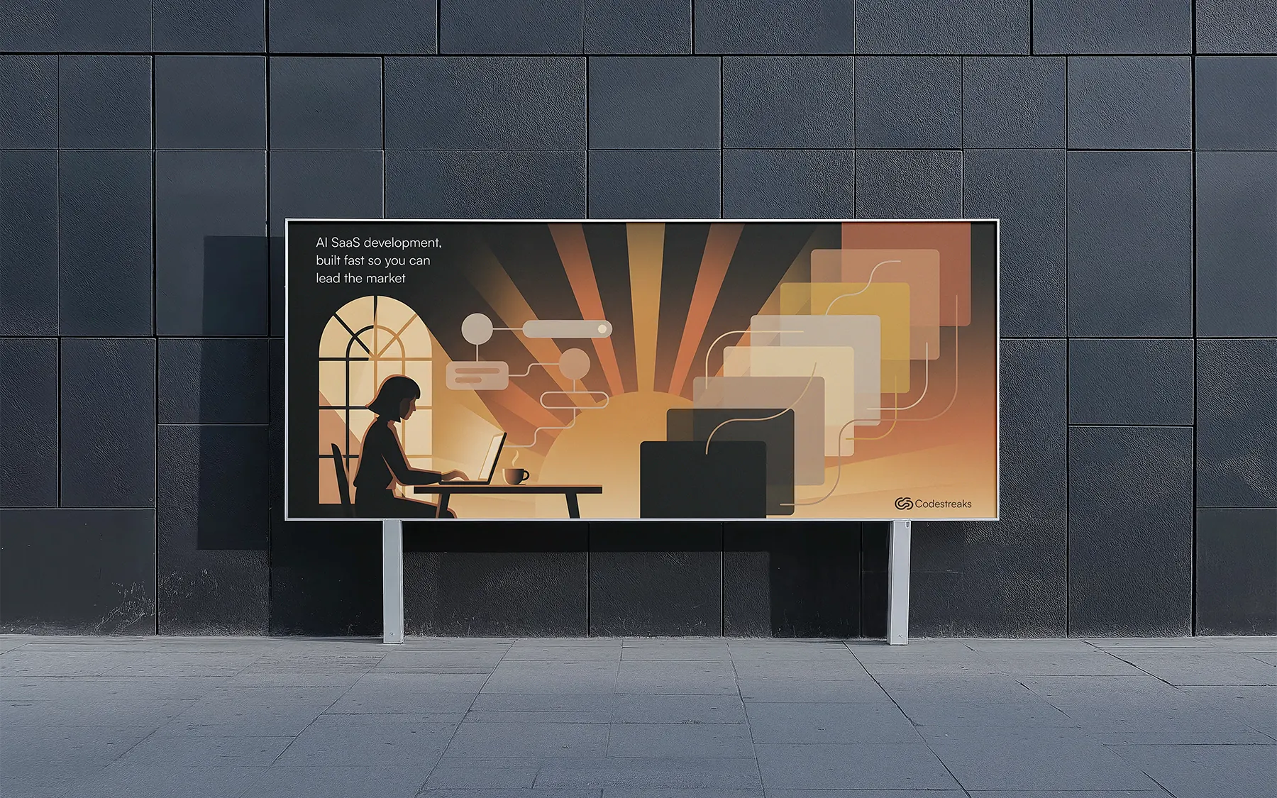
Wall Poster
Identity applied to poster design so the brand reads in public.
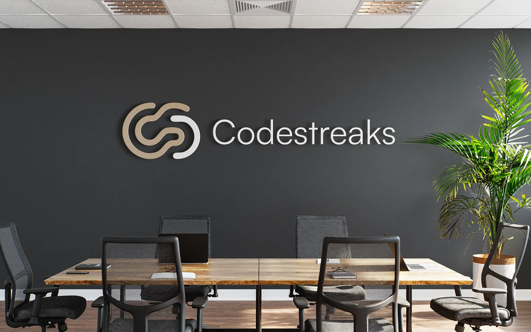
Environmental signage
Office signage using the icon-only lockup at architectural scale.
Launch campaign
Social launch frames built from the pattern system with a fixed type hierarchy.
MOTION
How the system moves
Mark assembles from three strokes over 640ms, then holds, no loop, no bounce.
Section reveals use a hard clip wipe rather than a fade, matching the grid language.
Accent underline draws left to right at 320ms on hover for every primary action.
RESULTS
Outcomes and evidence status
Brand rollout framework
Market context
The category is loud. Every competitor in AI automation was using the same gradient-and-orb visual language, which made a technically serious product read as a weekend experiment. Buyers were engineering leads with procurement budgets, and they were filtering on credibility signals before they ever booked a call.
Perception gap
CodeStreaks builds AI automations, agents, and AI-native applications, but their real product is trust. Anyone can ship code; few will hand over every credential, every model config, every line at delivery. That transparency is the brief, and the identity had to earn it before a single word of copy did.
Positioning decision
Position on infrastructure, not intelligence
System rollout
Category audit across 24 competitors in AI tooling and developer infrastructure.
In-market read
Technical buyers read restraint as competence, density beat friendliness in every interview.
Metrics hidden for now
Quantitative result cards are temporarily hidden until each metric has fully documented definitions, source snapshots, and reporting context.
NEXT
What I'd do next
01
Extend the system into a documented motion package for product onboarding.
02
Build a verbal identity layer covering error states and empty screens.
03
Run a six-month audit to catch drift before it compounds.