Clients don't want more compliance jargon,
Clients don't want more compliance jargon, they want a partner who translates it.
Identity for TaxDoctors — China & Pakistan based tax consultancy firm. Print · Digital · Social.
Taxation is rarely approached with confidence.
Every firm in this category claims expertise, so the claim carries no information.
Identity · Strategy · Consulting
Position on clarity, not complexity
Every firm in this category claims expertise, so the claim carries no information.
Clients don't want more compliance jargon, they want a partner who translates it.
The "doctor" framing outperformed generic "expert" or "advisor" language in tone testing.
A single confident red, used sparingly, read as more credible than a busy multi-color system.
The D-mark needed to work standalone, since it would appear far more often than the full wordmark.
Brand book highlights
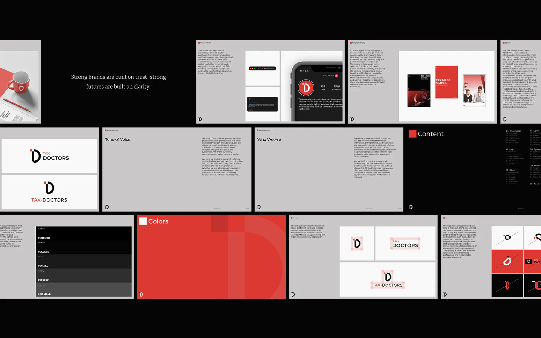

Read as trustworthy and precise to both individual and corporate clients.
Translate a bilingual, cross-border service into one coherent visual language.
Reserve a single confident accent color that signals action and authority.
A palette with reserved power.
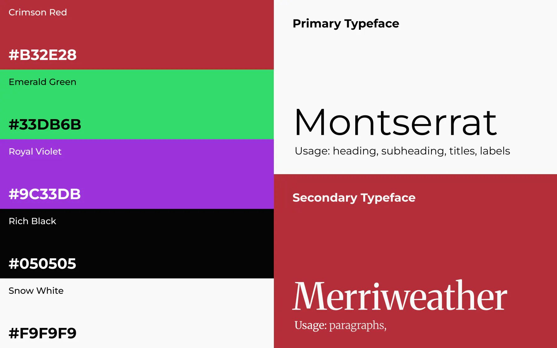
#DB3932Primary color. The mark, key accents, and calls to action.#050505Primary type and dark surfaces.#F9F9F9Primary background and light surfaces.#33DB6BSecondary accent (golden-angle extension), success and growth cues.#9C33DBTertiary accent (golden-angle extension), used sparingly for premium highlights.Type that holds at every size.
Montserrat · 700Who We Are
Headlines and section titles. Tracking tightens as size increases.
Merriweather · 400We are built on trust, accuracy, and accessibility.
Paragraphs at 16-20px, generous line height for long-form brand narrative.
Geometric Sans · 500ABOUT TAXDOCTOR
Section labels and eyebrow text, uppercase, wide tracking, always in Crimson Red.
Where the rules meet production.
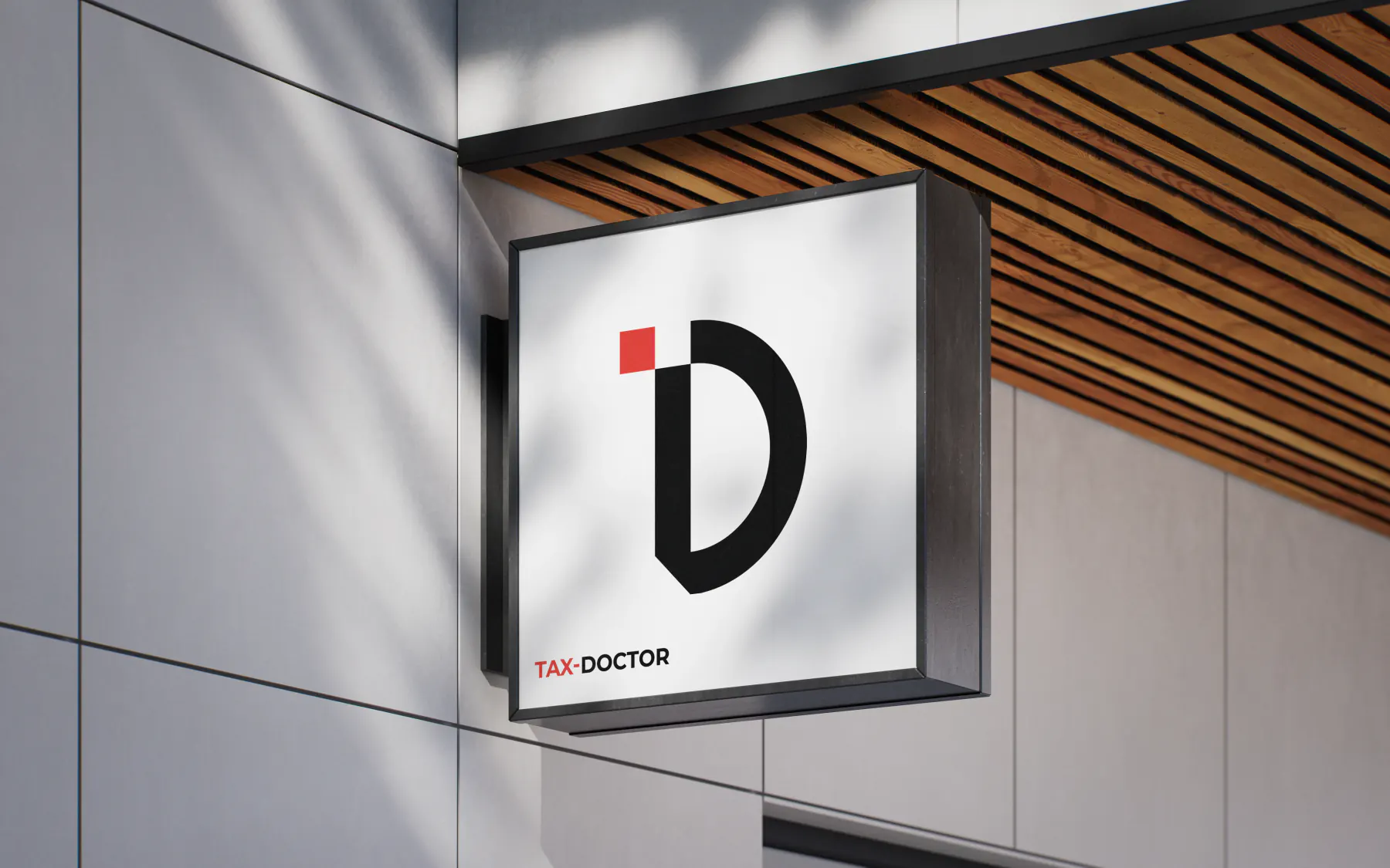
Office signageOffice signage using the icon-only lockup at architectural scale.
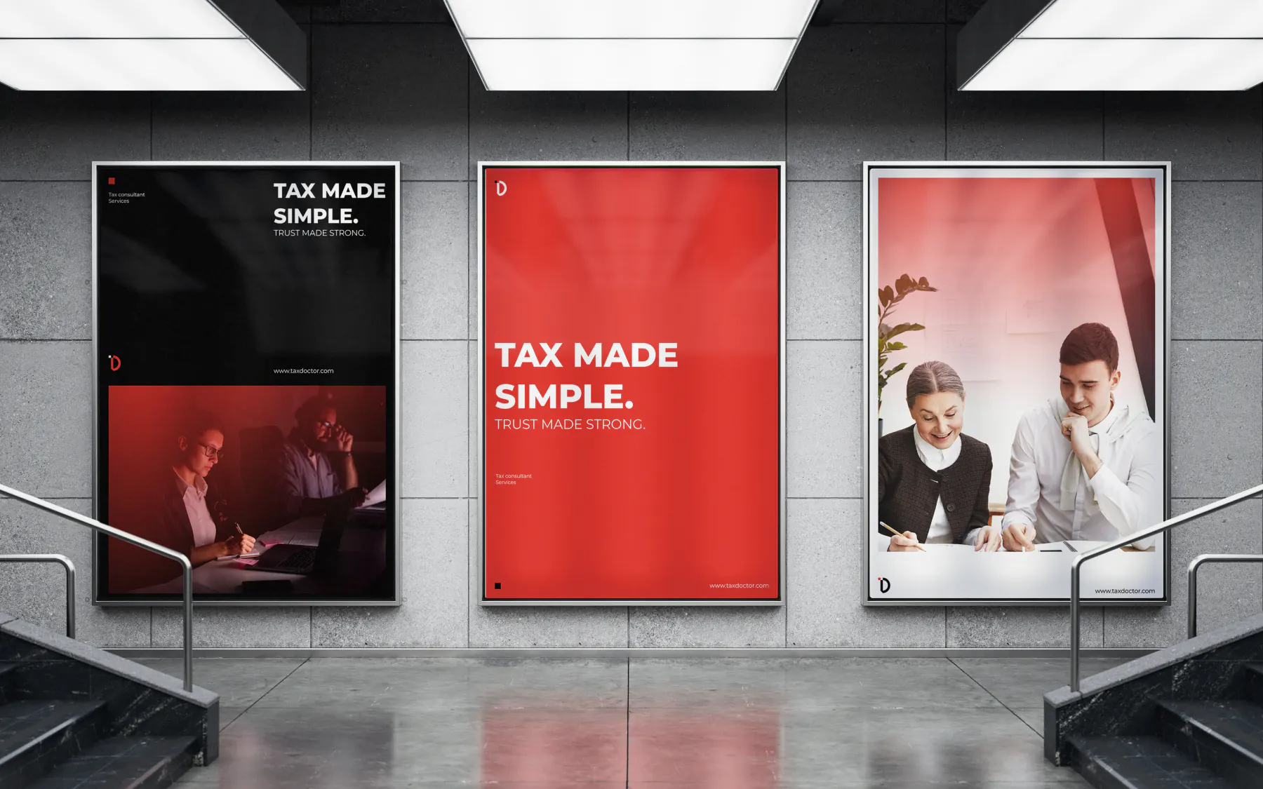
Indore PosterIndore Poster using the typography images and the color system
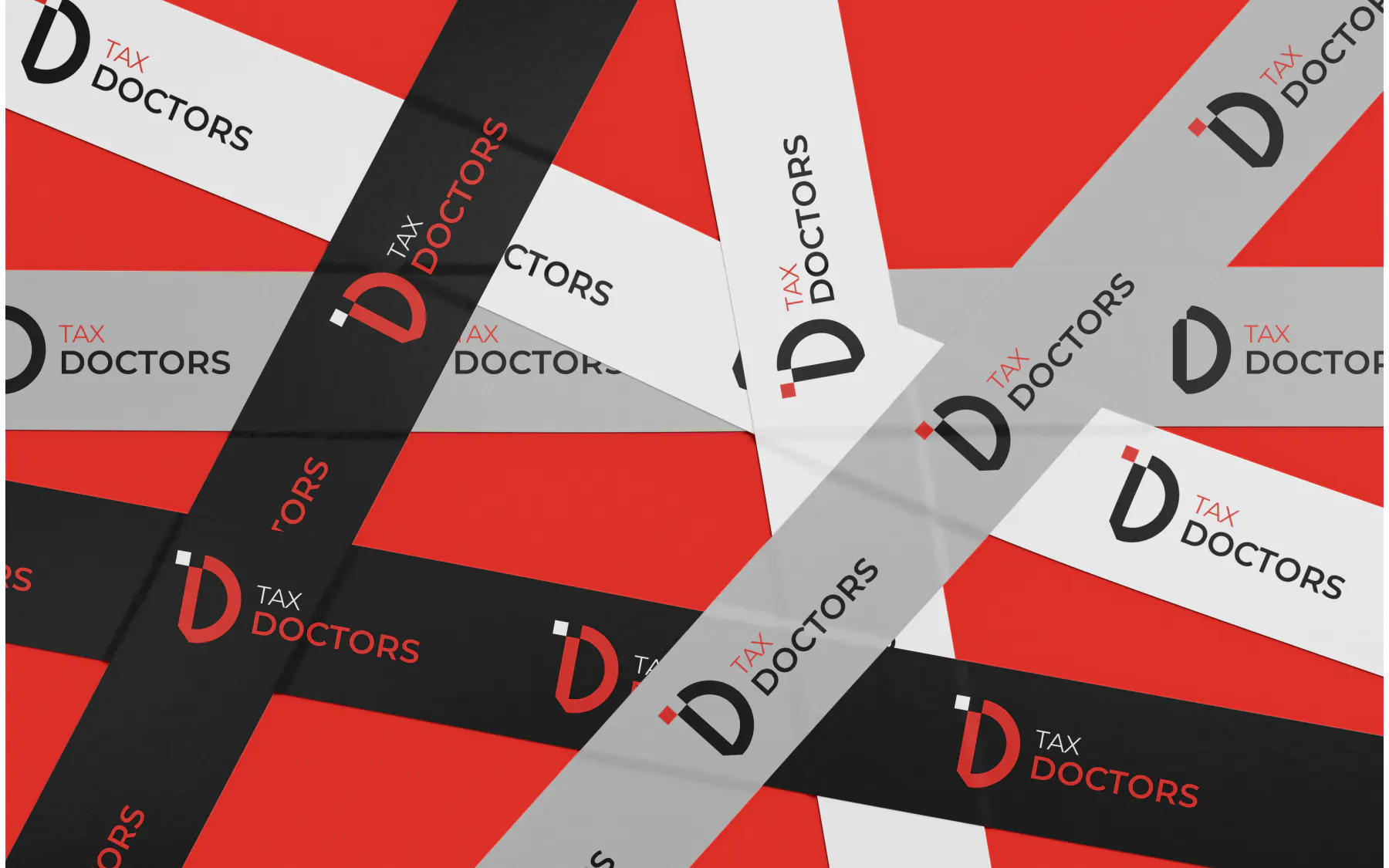
Tape DuckStickey tape duct using the colors and logos
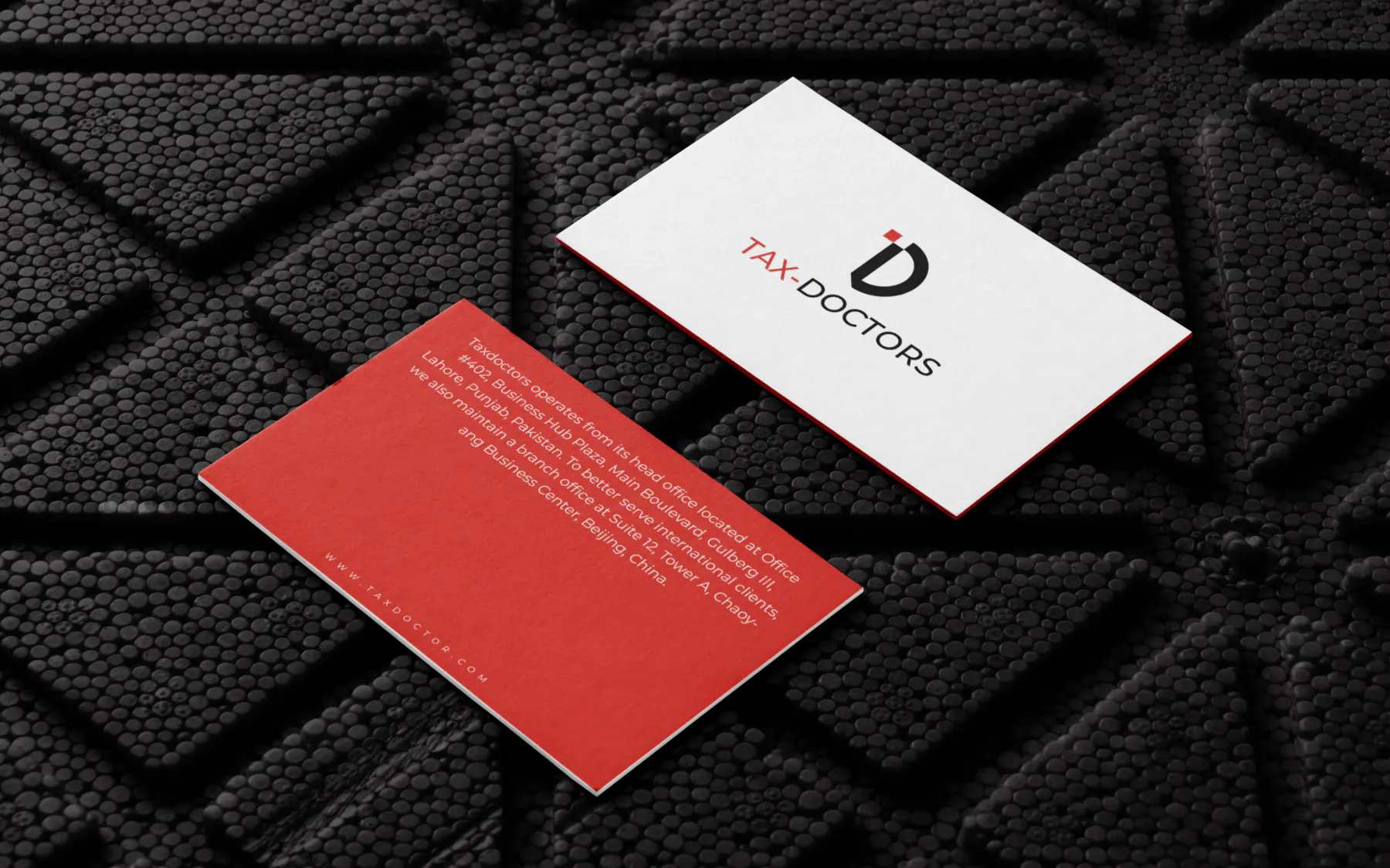
Business CardBusiness Card using the colors and logos
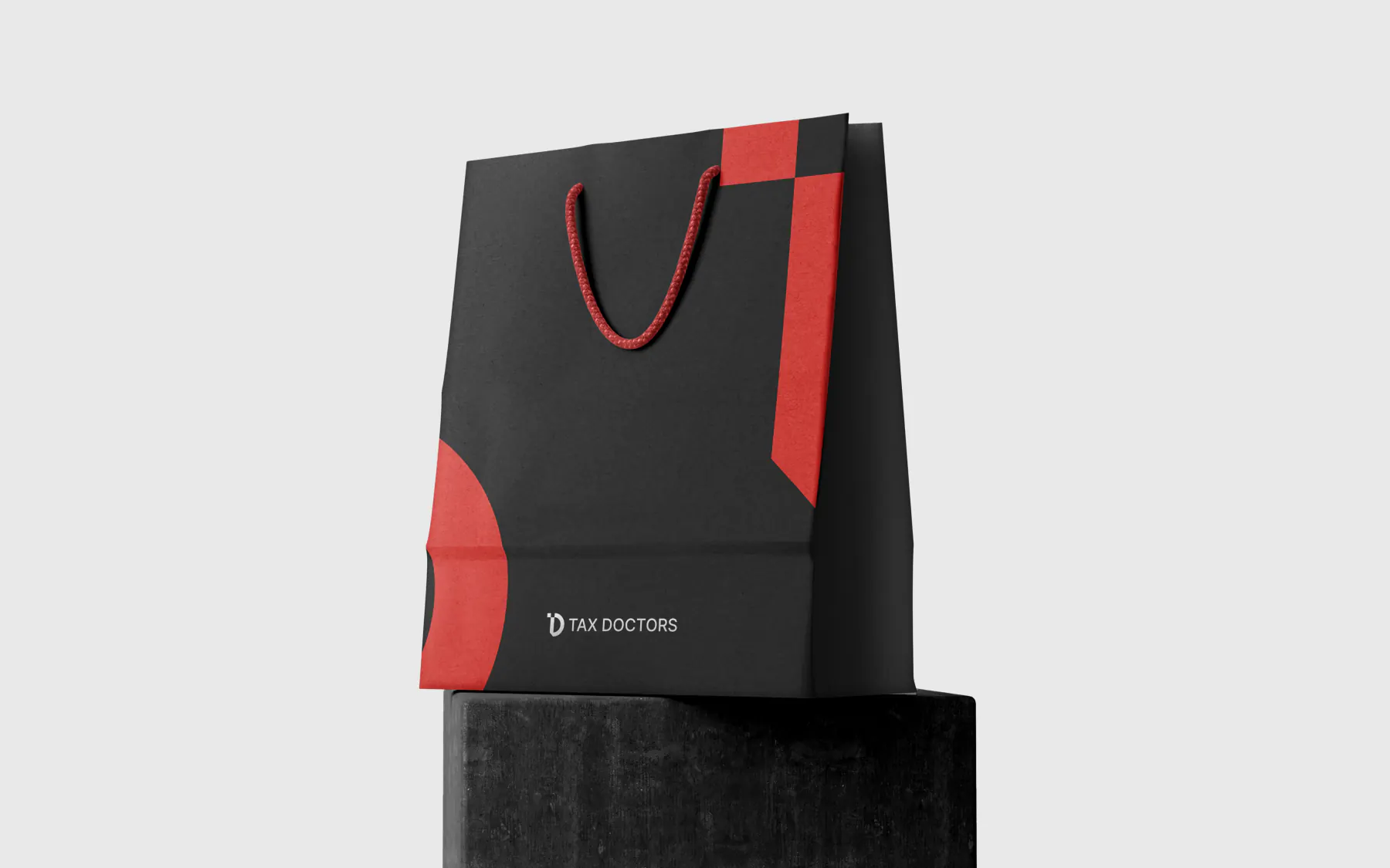
Hand BagHand carrying bag using the colors and logos
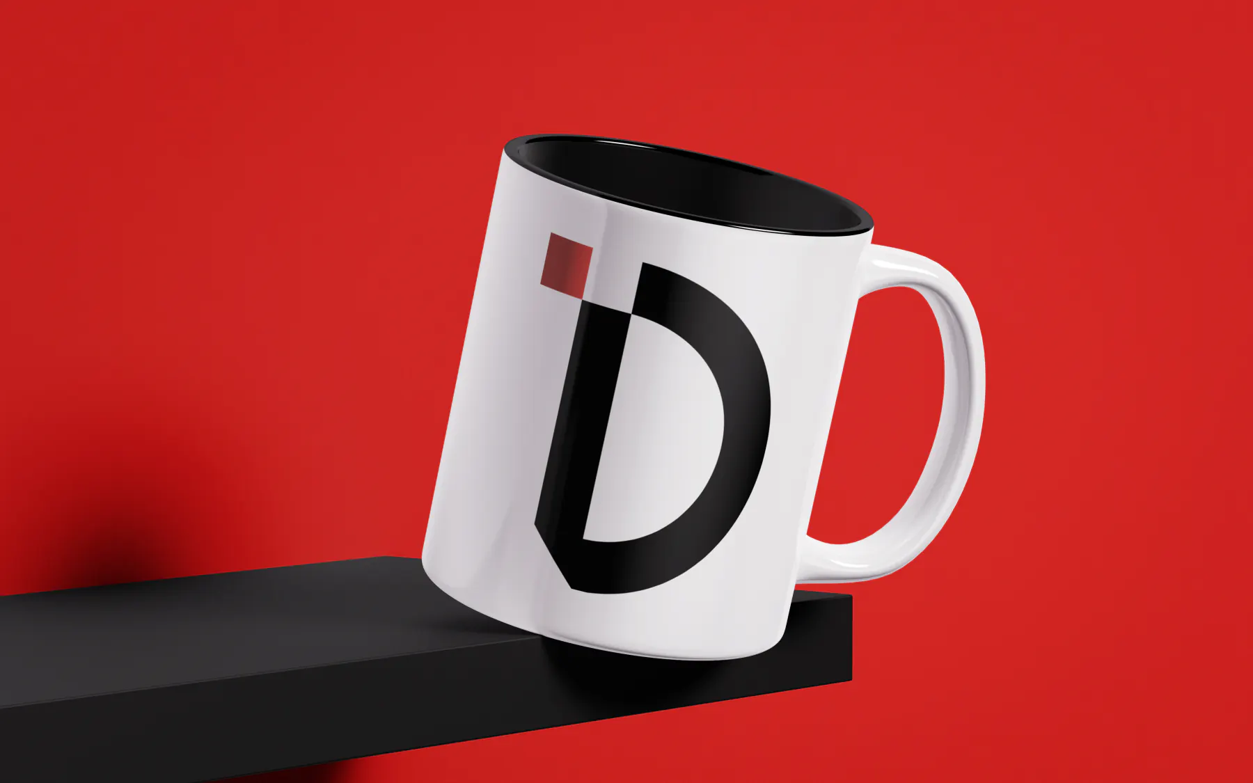
Coffee CupCoffee cup having large brand logo icon on it
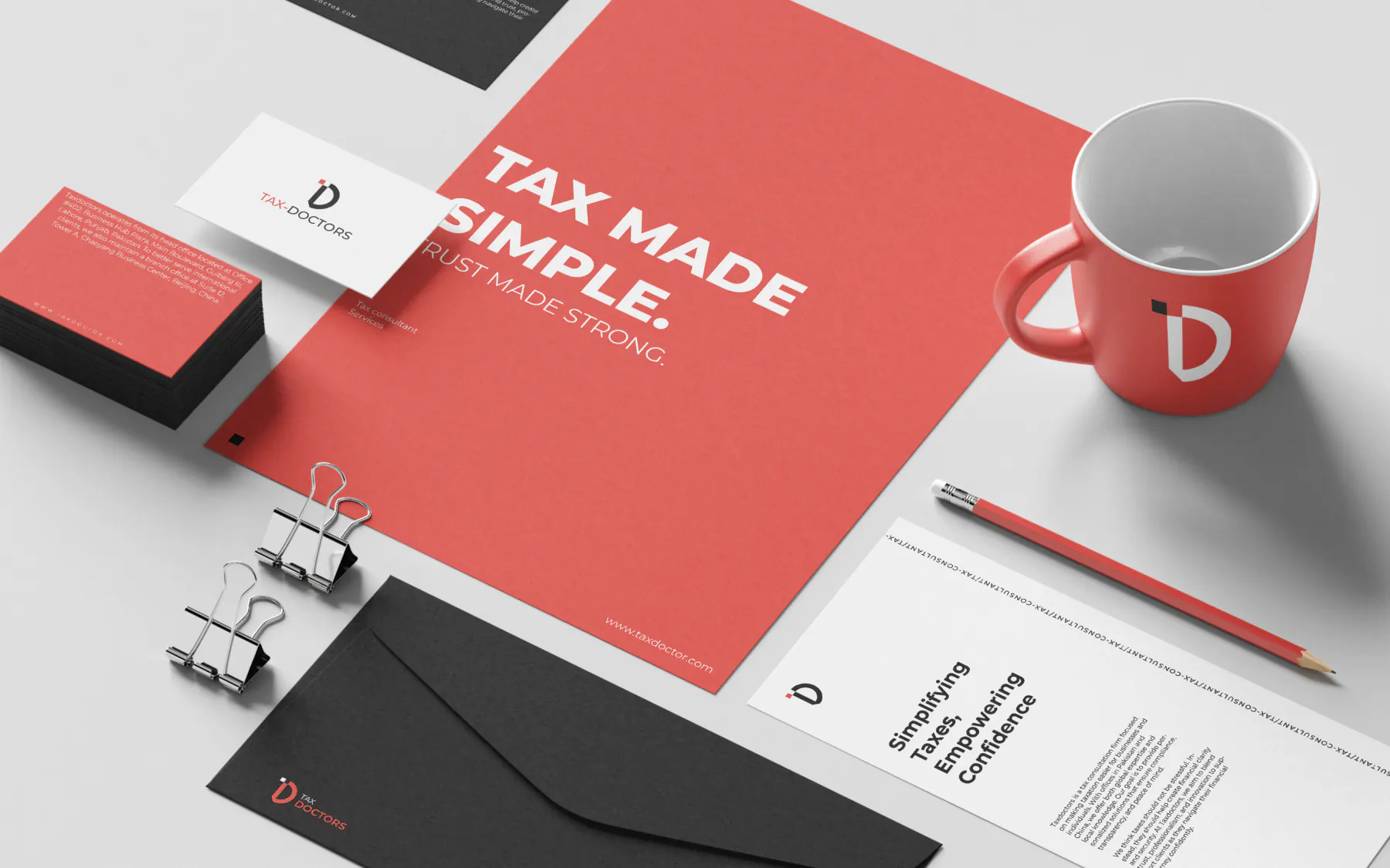
StationeryStationery design using colors system, typography and logos
Read as trustworthy and precise to both individual and corporate clients.
Translate a bilingual, cross-border service into one coherent visual language.
Reserve a single confident accent color that signals action and authority.

TechMeka's brand was two disconnected hex codes with no system behind them - no scale, no rule for a third color, nothing that held up once dark mode or real financial data entered the picture.
Open case →Brand identity and a production-ready website, delivered together as one system. Direct communication with the founder who designs the system and writes the code. No account managers, no handoff gap.
Or write directly: hello.usamazahid@gmail.com