OVERVIEW
The product at a glance
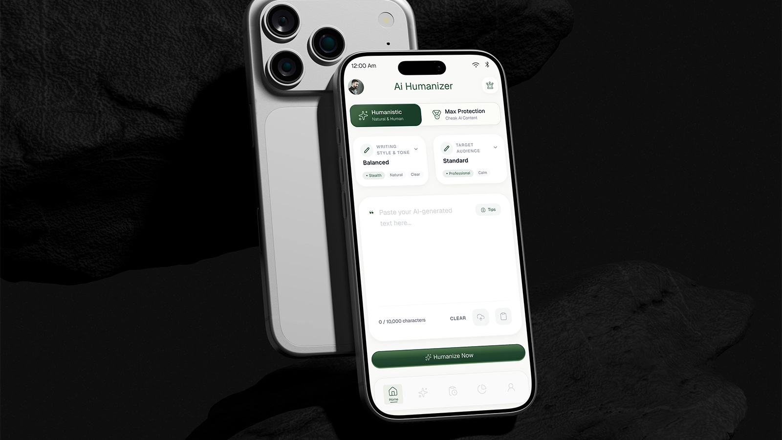
Ai Stealth Humanizer app was not able to get traction because of bad ui/ux design. I led the end-to-end UI/UX redesign of the mobile app, focusing on good ui/ux design and user-friendly and engaging app.
Tools
Redesigned AI Stealth Humanization App
High-fidelity home screen with streaks, today list, and quick logging.
PROBLEM & GOALS
What we set out to fix
New users dropped off within few days because bad ui/ux design, the home screen was cluttered many filltered are scattered all over the home screen, and text input was too down user need to scroll down 2 or 3 times to input text.
Design goals
- 01User confused about how to use the app
- 02Mostly users are not able to understand the app and how to use it.
- 03Ui/Ux design was not user-friendly and engaging.
RESEARCH & INSIGHTS
Listening before designing
Methods
- 019 user interviews
- 02play-store review mining
- 03Competitive teardown of 3 apps
Key insights
- 01User did not want to pay for that app because they did not understand the app and how to use it.
- 02Scatterd filltered are scattered all over the home screen.
- 03Poorly designed home screen and navigation.
Interview feedback
Insite user feedback and interviews
Competitive teardown
Pattern audit across leading Humanize Apps.
USER FLOWS & IA
Structuring the experience
I restructured the information architecture of all the screens, identify the user pain points and solved them, and a lightweight flow.
Ux Experince Sheet
People Reviews and Ux problem Identification.
App Flow
Evening in a synchronize flow.
WIREFRAMES
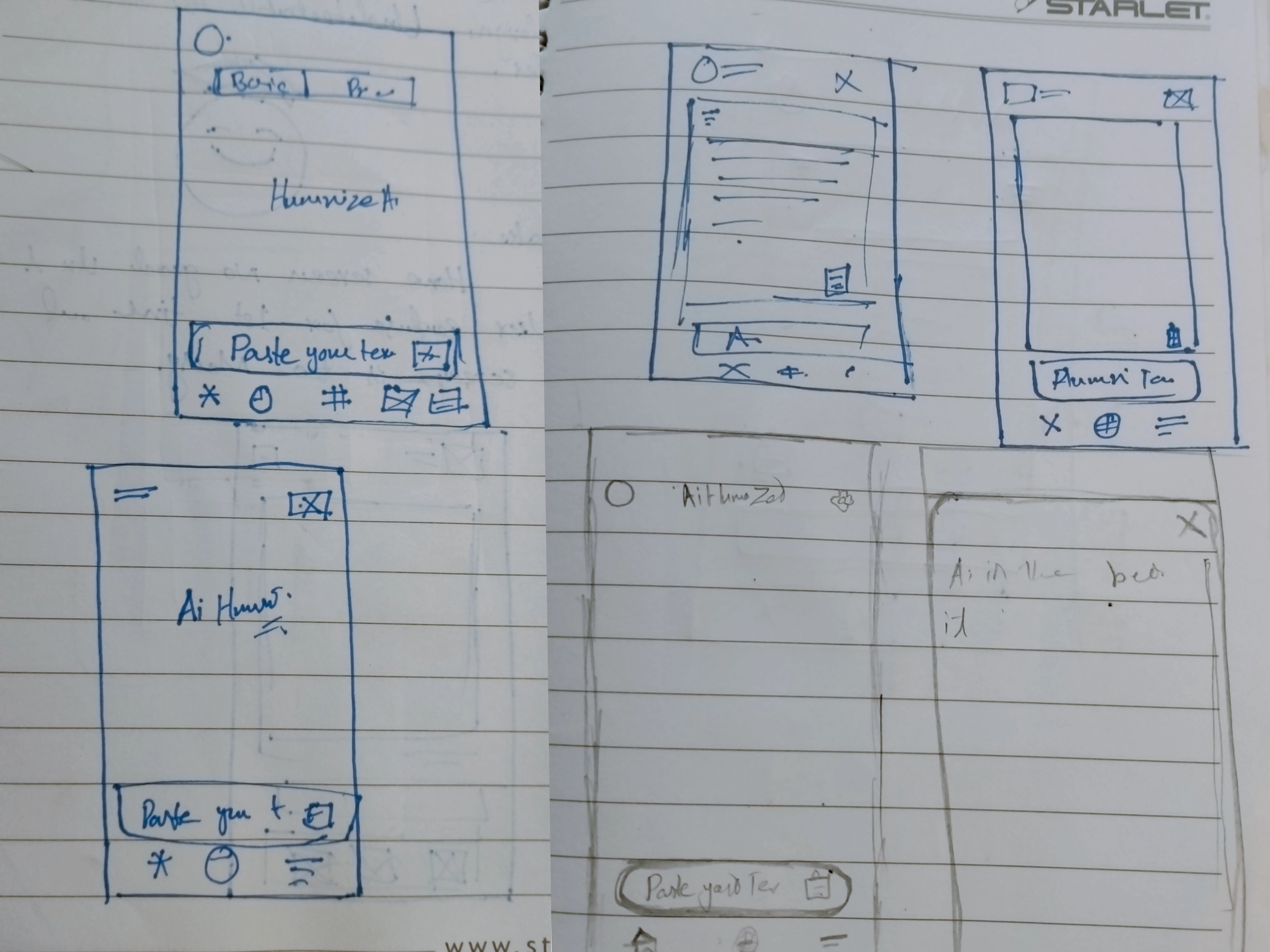
Low to mid-fidelity exploration
Low and mid-fidelity exploration of the home, Peocessing, Results, and history screens.
UI / VISUAL DESIGN
The final visual system
A calm, high-contrast visual system with a single accent, generous spacing, and friendly progress feedback that celebrates consistency over perfection.
color.accent
Single green accent reserved for progress, detection states, and primary actions..
type.scale
Clear display and body typography for effortless readability.
radius.card
Soft rounded corners create a cohesive and approachable interface.
space.rhythm
8pt spacing rhythm for calm, predictable layouts.
PROTOTYPE & INTERACTION
Designing the feel
A high-fidelity prototype validated the logging and review loops before build.
Tap through onboarding, logging, and review.
- 01Screen transitions use a 300ms ease-in-out for smooth navigation.
- 02Processing state aimated mascot for engaging user experience.
OUTCOME
The measurable result
DETECTION_ACCURACY
98.6%
+6.4%
AVERAGE_SCAN_TIME
2.3 SEC
45% faster
USER_SATISFACTION
4.9/5
from 4.2
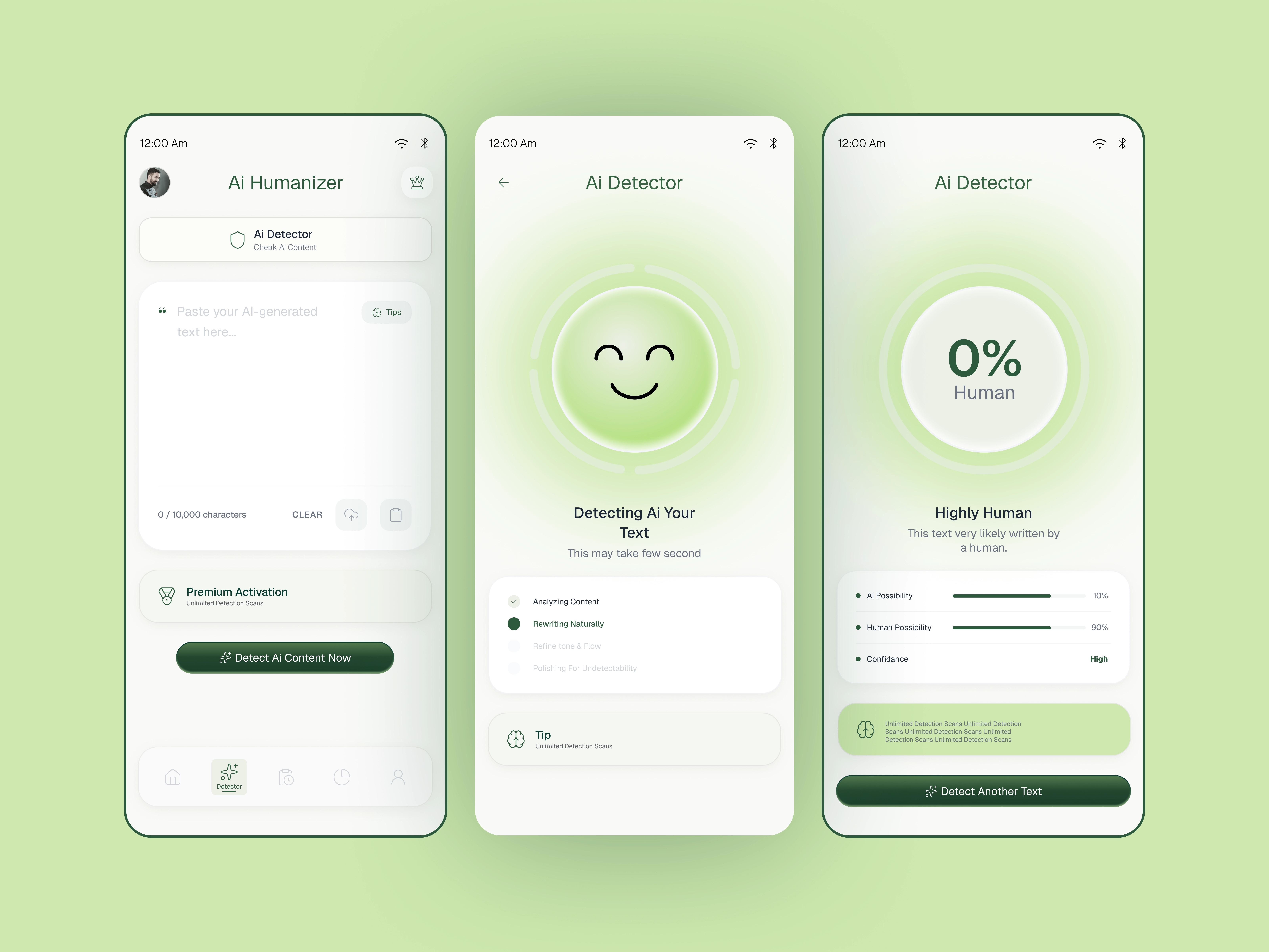
Shipped app in context
The redesigned app in everyday use.
REFLECTION
Honest takeaways
The biggest improvement was clarity, not complexity. Simplifying the detection flow, surfacing confidence scores, and providing actionable humanization suggestions helped users trust the results and complete scans faster.
What I'd do next
- 01Introduce sentence-level AI detection insights.
- 02Test one-click humanization with multiple writing styles.